The Basics of Functional App Design
Creating app mockups has never been easier thanks to BeFunky's easily customizable mobile UI templates. App mockups are essential when designing the UI (User Interface) and UX (User Experience) of an app. Like with all design, you must know what and who you are creating for in order to make the most effective design. When designing app mockups, there are some practices that need to be followed to ensure user comfort and ease of use.
We are going to go over the best design practices that you can follow when designing your own apps. When you are ready to start designing, use BeFunky’s digital app mockup designs in the Graphic Designer. The best part is that these are all for free!
4 Design Practices for the Best App Design
We’ve already discussed 3 Key Principles for Mobile UX Design, which include maintaining a simple app design (keeping in mind that you’re designing for thumbs and not cursors), designing with Z-Shape and F-Shape principles, and ensuring that your app design is predictable for the user. Brush up on that article because it is an important foundation to know before implementing the practices below. Let’s get into it.
1. Think About Accessible UI/UX Design
The majority of app users skim through information in these patterned sequences: Z-Shape and F-Shape. Good app design will create these patterns with important elements landing on the “fixation” points along these shapes.
We are going to go over the Z-shape design which works best with pages that have lots of visuals as well as copy, say on an ecommerce or streaming app. Let’s design a layout for an e-commerce sight while we discuss this practice.
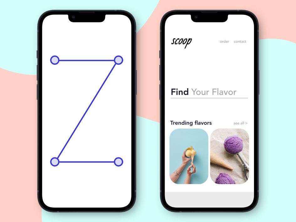
As you can see, right when your eyes look at this app design page, your eye immediately looks at the logo in the top left corner of the screen, glances sideways, and then travels down the page in a horizontal pattern locating the brightly colored part, and then scanning, again, to the right.
2. Choose the Right Fonts for App Design
We’ve chatted about the best fonts for your designs, as well as the importance of font pairing in "The Ultimate Guide to Font Pairing." The use of fonts is even more important in app design when designing for such small screens. This practice follows the simplistic principle that we discussed in this article.
Fonts used in app design need to be simple and legible. Take a look at this same app design from above, but if we used fonts that were not simple, clear, and did not use font pairing techniques.
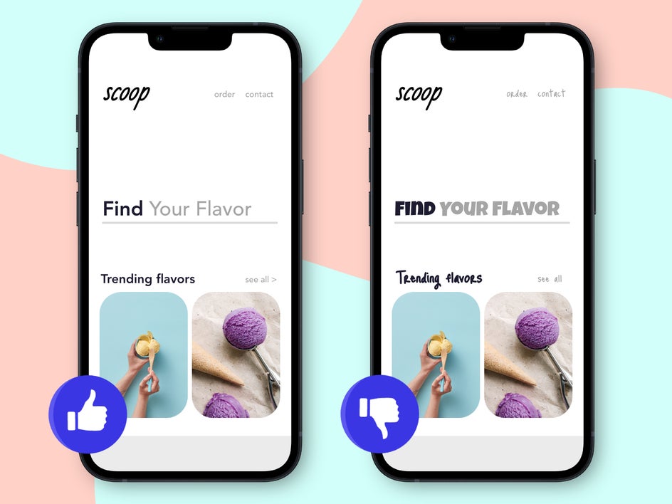
Pretty bad on the eyes, right? Good app design prioritizes simplistic fonts. The kinds of fonts that will be good for app design are mostly sans-serif fonts, with your occasional serif font. Steer clear of decorative or script fonts. If using BeFunky’s guide, the Lifestyle Blog, Website Design, and Modern Coffee Shop font pairing examples are best for app design.
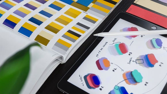
3. Use Color Palettes That Are Easy on the Eyes
The use of color is very important in app design. Again, it is important to follow the simplistic principle and opt for a design with a neutral background and maybe a hint of color in the items that you want to emphasize.
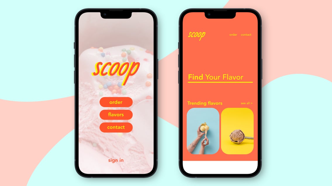
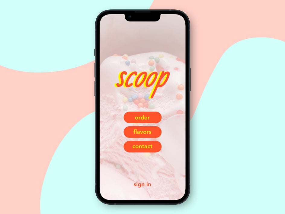
If you have your brand color palette figured out, you can use these colors in your app design. Try different variations. If you want your app to be simple, use a light neutral background like white, grey, or cream. If you want it to be playful, choose a color. I usually like to keep my backgrounds light in my app designs, even when using color but you could also embrace the variations in color and create a look that is more punchy and playful like below.
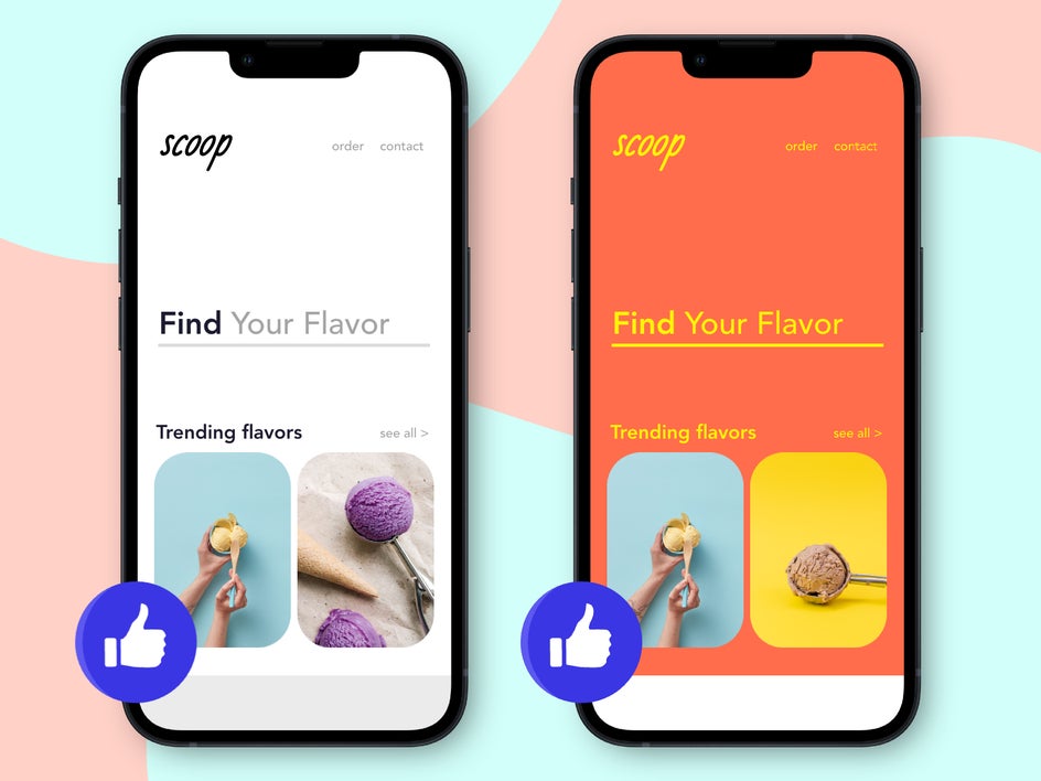
You can see how these two different color palettes communicate something different about this ice cream brand. The left option makes the brand look cleaner, more professional, and modern. The right option makes the brand look more playful. Both options can use colors within your color palette, but in different forms.
And of course, there are palette combos that just don't work. When opening an app for the first time, you don't want your user to have a poor first impression due to color alone. Take a look again at this example when the app uses a bad or awkward color palette.
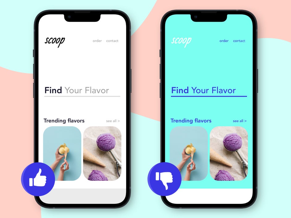
When you pair colors that are hard to read when layers on top of one another, it won’t matter how good your layout or font is. This is the power of color in your design, as the color palette you choose can either make or break your app design!
Whatever color palette you choose, make sure it is consistent across the board with your brand’s photography and design.
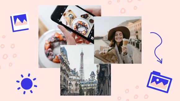
4. Use Photos Strategically in Your App Design
Photography plays an important role in app design, especially for featured images. You want to make sure that your imagery follows the same or similar color palette and app design as your overall brand aesthetic. If you haven’t taken the time to develop this, or if you are designing an app for someone else, these are important elements to know or have so that you can create an app that is in line with all of the other design choices.
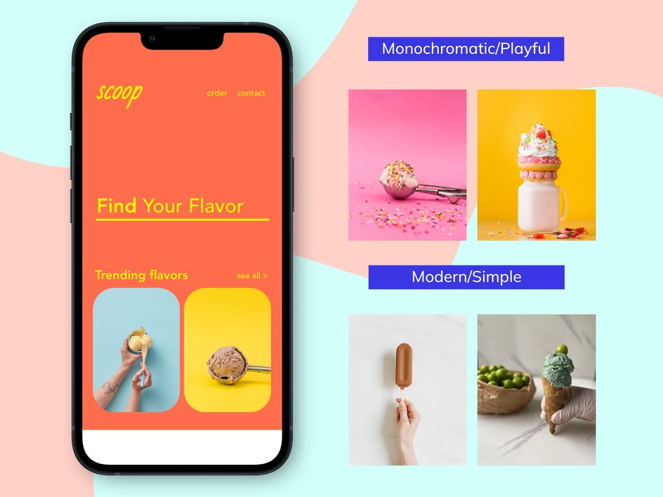
Let’s take the playful design from above and look at the kinds of photos that pair well with that design. If the app design we are building is colorful and playful, we can choose to use color to our advantage in our photography and create images that are also colorful and playful. You wouldn’t want to pair modern or neutral images with this color palette since they don’t belong in the same brand aesthetic family.
If you are new to design and color intimidates you, try opting for an app design with a more simplistic or subdued color palette so that the products and images, themselves, are the key focus of your app. That way, you can take photos however way you want and they will more easily pair with a blank canvas.
We talked about how to use photos as featured images when pairing them alongside your color palette, but let’s talk about how to use photos in another area of your app design.
Photos can be great to use in app design if you use them as a background. If you do this, just make sure to place an overlay on top of your image so that the text comes through.
App Design That’s Functional and Beautiful
Good app design and development should fuse functionality and beauty. It is about learning the foundational elements so that the app itself is functional, but if you don’t design it in a way that follows the practices above, good development won’t even matter! When you are ready to start creating, head to BeFunky’s Graphic Designer to get started.