How to Design the Perfect Brand Color Palette

When you’re creating your brand, one of the most important things to think about is your color palette. Designing a beautiful color combo isn’t as simple or straightforward as it might seem. Colors are not only visually impactful, but they also invoke specific emotions and subconscious responses. People strongly associate certain colors with certain themes—that’s why it would throw you off if you saw a law firm using pastel pink on a billboard or a day spa advertising in bold reds and blues.
When picking colors to use in your logos and marketing materials, you need to be thoughtful about what associations people will make when they see them. The colors you pick also need to work well together. Otherwise, your brand might seem tacky, unprofessional, or just plain unappealing.
So how do you make sure your brand colors work well for your business and work well with each other? Luckily, there’s plenty of research out there that can help! In this article, we’ll first take a look at some of the most famous logos and brands. These can help you decide which colors to use for your own business. After that, you’ll learn how to choose the perfect color combo by learning just a little bit of color theory. By the time we’re done, you’ll be a color connoisseur. If you want, you’ll even be able to design your own logo.
What Colors Are Good for Branding?
The best color for branding depends on the brand. Consider your industry, your mission, and the feelings you hope to evoke. Do you want your brand to be a calm, soothing presence? Would you rather create excitement and delight? Is your brand aloof and intriguing, or strong and dependable?
Here are some examples of different colors and the feelings they’re associated with:
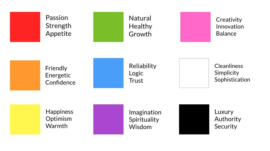
You can see why a tech company like Apple relies on the color white in its branding—they want to be recognized as simple and sophisticated. Luxury fashion brands use several shades of black. Fast food companies like McDonald’s and Wendy’s utilize red because it triggers a person’s appetite. The Whole Foods logo is green because it focuses on goods that are natural and healthy. Most brands recognize the psychological effects of colors and use that to their advantage, using certain colors to create trust and attract people to their products.
These aren’t totally hard and fast rules, but they’re definitely things to keep in mind when you’re creating your brand’s color palette. People like to know what to expect when they see a new business, so unless you’re really intent on surprising your audience, you should always consider how color is already being used in other brands and advertising.
For more information on color psychology and how color can impact emotions, you can check out this in-depth list of colors and their psychological effects in branding – both the positive and the negative.
The Best Color Combinations for Brands
A brand color palette can have up to 10 colors total, but you should have 4 or fewer colors for most of your branding, like your logo. Finding out what colors look best together isn’t challenging as long as you understand a little bit of color theory.
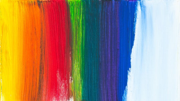
To pick color combinations that definitely look good together, all you have to do is look at a color wheel. Colors of the same hue, but different saturation (like navy blue and sky blue), are monochromatic. Colors next to each other, like red and orange, are analogous and will always work in harmony. Colors across from each other on the color wheel are complementary colors and will provide contrast while also creating appeal. You can also draw a triangle inside your color wheel to find three triadic colors that work well together.
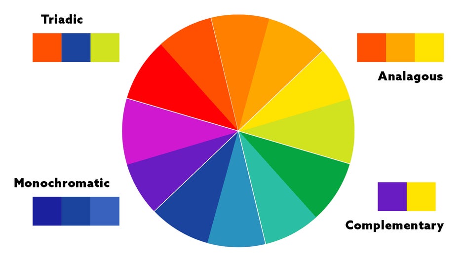
Creating 2-Color Combo Palettes
When trying to find a good two-color combination, complementary colors often work best to provide the most harmony and contrast.

Creating 3-Color Combo Palettes
When looking for three colors that look best together, create a triangle on the inside of your color wheel. Play around with the saturation (intensity) and brightness of each color to get a unique, cohesive palette!

Analogous and monochromatic color combinations represent stability. They’re easy to use, but not as memorable as other color combos, and can be associated with many different brands. Complementary colors are the most eye-catching, but can easily clash. Using three or more colors can make your brand more unique, but might make it harder to cultivate a solid brand identity. There are pros and cons to every type of color combination, so think about what would work best for your brand. You can also use a color palette generator and play around with the settings in order to find appealing combinations.
Accessible and Color Blind Safe Color Palettes
Another thing to think about when picking color combinations is accessibility. Color combinations with low contrast make things difficult to read and use even for people with perfect vision—and most people don’t have perfect vision. In fact, around 7-8% of the population has some form of color blindness, which can make it impossible to view low-contrast websites or images.
When trying to figure out if your color combinations have enough contrast, try using one brand color for text and another for the background. Low contrast colors will blend into each other and be illegible, while high contrast colors will stand out. High contrast colors are more readable and more accessible!
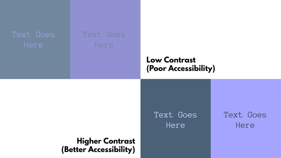
You can learn more about accessible colors and color blind safe palettes here. Always keep your audience in mind and make sure your materials, website, and social media are easy to use!
How Do I Create a Brand Color Palette?
Now that you’ve learned a little about color psychology and theory, you’re much more prepared to create a color palette for your own brand. You can use the Graphic Designer to create your palette; just add multiple squares to your page with the Graphics tool and change the color of each square in the sidebar.
First, choose your 1-3 main colors. Our brand is a bookstore that focuses on dependability and tranquility, so we’re going to use blue and green. These are also analogous colors, so we know they look good together! Because we want to evoke feelings of peace, we’re not going to use bold, flashy, high-saturation versions of these colors. Instead, we’ll use a calm, low-saturation light blue and a dark teal green:

While blue and green are analogous and therefore don’t have much contrast, the blue we chose is light while the green is dark. This means they’re contrasting through tint, rather than hue. To check if your colors have enough contrast, you can copy and paste them on top of each other in the Graphic Designer.
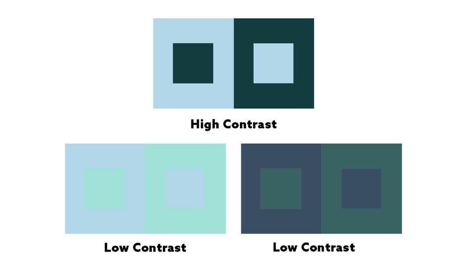
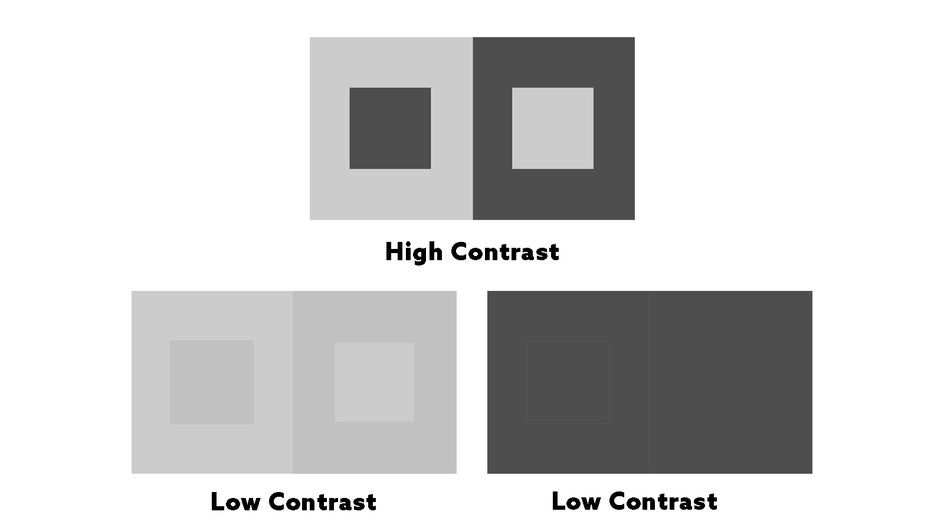
By saving this image and then using a Black and White effect in the Photo Editor, we can make check the contrast more easily:
Now, back to the Graphic Designer. A third, contrasting color here will help with visual interest in our marketing tools, so we’ll use a warm pink. We’ll probably need a dark neutral color for text as well as a light neutral color for certain backgrounds. Here’s our finished 5-color palette:

That’s all that’s absolutely necessary, but if you want to add more than five colors to your brand palette, you can! Just make sure you’re thinking through which colors you’ll really need—the more colors you use, the more muddled your brand identity can become.
If you want to use more than five colors, try to keep them in the same family. For example, here’s an 8-color version of our brand palette. Notice how most colors are just a few shades away from our main branding colors. This helps create a more cohesive overall look.

Once you’ve created your color palette, make sure to write down the HEX codes of all your colors so that you can keep your palette identical across all websites and editing platforms. You can also save and manage your color palette on BeFunky so that your brand colors are always ready!
Here are how our color palettes look on a flyer, designed with the BeFunky Flyer Maker. We added a little bit of yellow to make it pop: Remember, you don’t need to stick to 100% of your palette 100% of the time!

Ready to Design Your Own Brand Color Palette?
As we said before, creating an appealing, effective color palette for your brand isn’t as simple as throwing a few random colors together. But with just a little bit of forethought and practice, you can easily create an attractive color scheme for all your branding needs. From creating a blog logo to stepping up your social media, a thoughtful color palette is one of your most valuable branding tools. Get started on your palette today with the Graphic Designer!