Working With Design Elements
BeFunky's Graphic Designer has an extensive library of templates to make the creation process easy – regardless of experience. But it also includes all the elements necessary to create a design from scratch – seamlessly and unique to you.
The Importance of Design Elements
Your design is made up of a collection of design elements that are laid out based on a few design principles. This is why it’s important to consider your design’s purpose when you sit down to start a new project. Are you going to print it or share it to your social media? Are you going to use photos or illustrations and graphics? What is the message you want to send with your design?
The best canvas size, imagery, fonts, and graphic elements will be influenced by your answers. Canvas size is important when considering where you’ll be sharing your design. For example, an Instagram post canvas should definitely be in a 1x1 square, and it should utilize space to avoid overcrowding. Imagery is important when thinking about marketing products or services that are heavily dependent on clarity and color value, like in real estate. And the type of graphics should be utilized depending on the design’s theme – whether that be organic, geometric, or abstract.
How to Create a Design From Scratch
In this tutorial, we're going to show you how easy it is to start and finish an original design that aligns with your vision in just a few steps. And keep reading beyond for some inspirational examples that display a range of possible projects.
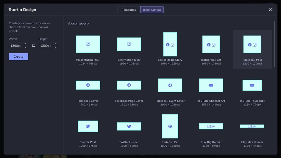
Step 1: Start With a Blank Canvas
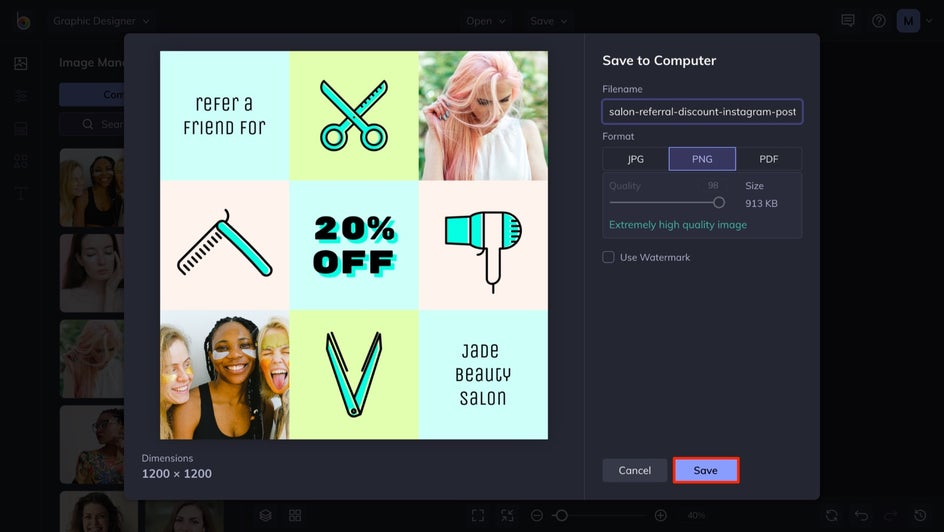
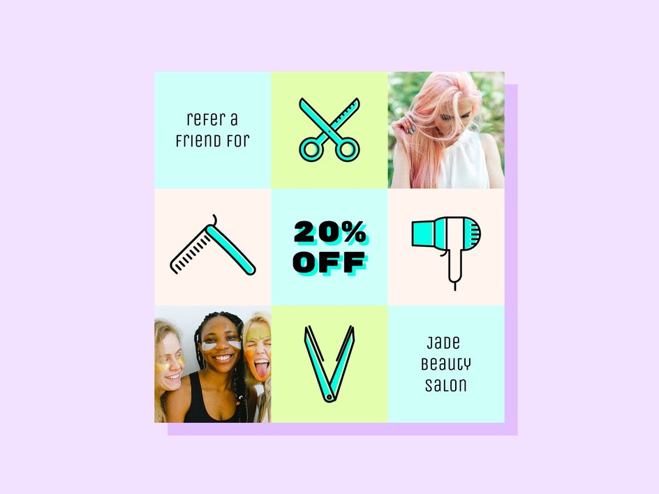
Since we're creating a design from scratch, we're going to head to the Blank Canvas tab in the Graphic Designer.
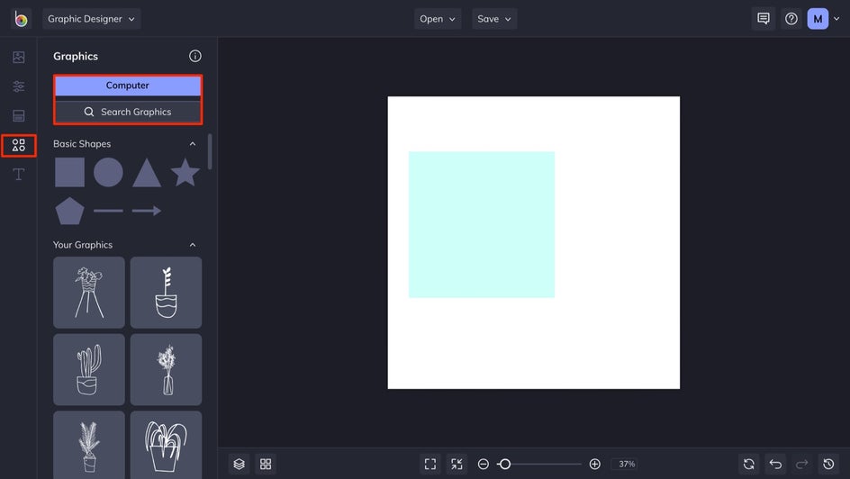
Step 2: Create Your Base
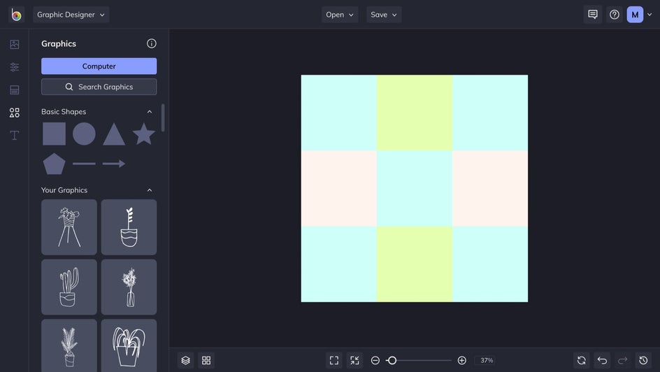
Now, it's time to set the stage. For this example, we're going to head to the Graphics tab and use some basic shapes to create a base for our design.
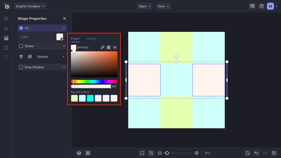
Here, we're using simple squares to make a multi-colored grid, which will be used to display our text, images, and graphics in a neat and effective way. Clicking on a graphic from the Basic Shapes category will open the Shape Properties menu, with which you can add a fill, change the stroke, and more.
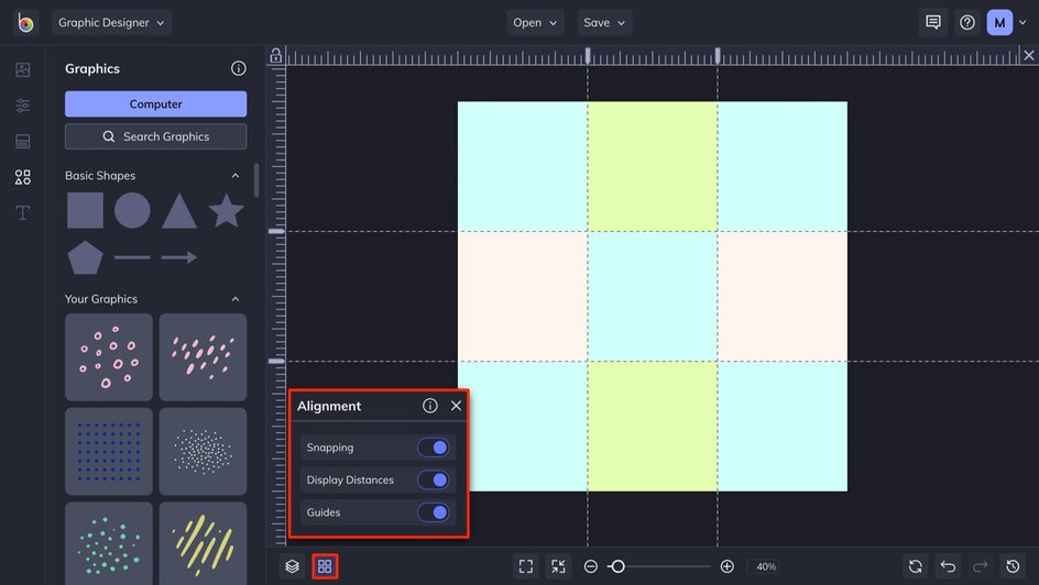
If you click on the Alignment button, found in the bottom-left of your canvas, you'll find three useful tools for getting your design looking crisp. Snapping assures that your graphics will snap into place to create perfect grids and other arrangements, Display Distance will give you the exact distance between assets, and Guides allow you to set horizontal and vertical line guides. With these tools, we've assured that our grid is perfectly aligned.
Step 3: Select and Customize Additional Graphics
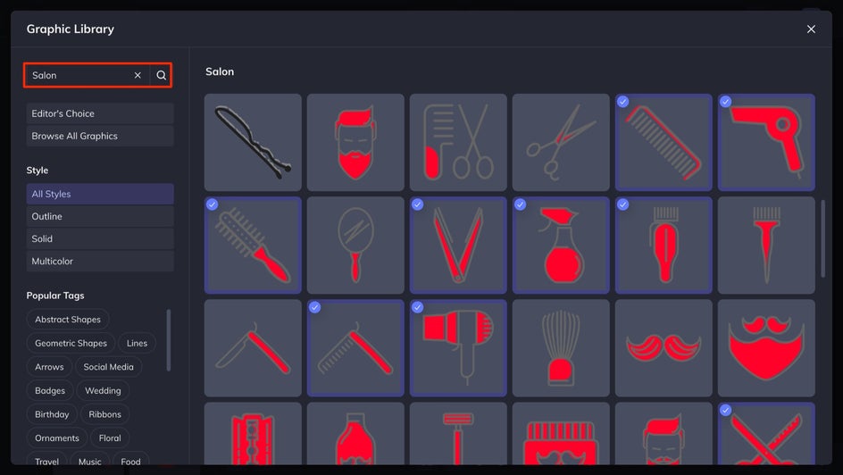
To add more graphics to layer on your design, click on the Search Graphics or Computer buttons in the Graphics tab to browse our library or upload your own.
Use the search function to find particular graphics, or check out our Popular Tags section. Once you click on a graphic, a blue checkmark will appear to let you know that it's been added to Your Graphics.
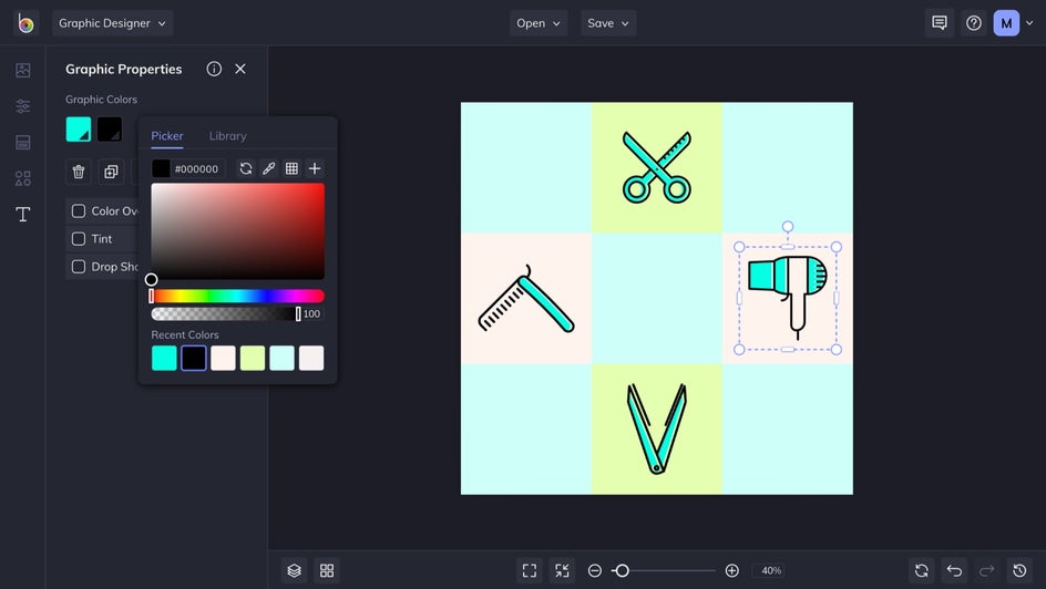
Clicking on a graphic will open the Graphic Properties menu, with which you can change the color, add an overlay, and more. Here, we changed the graphic colors to match the color scheme we've set.
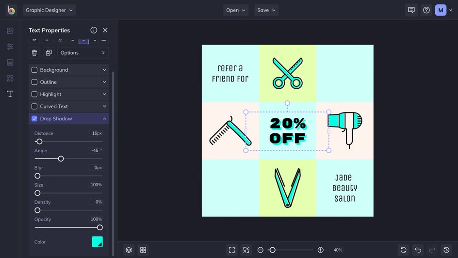
Step 4: Add Text
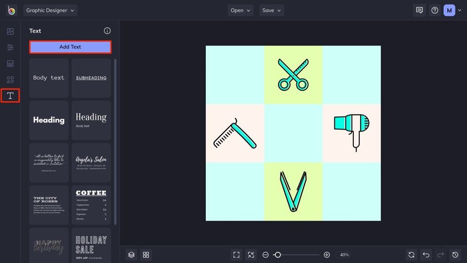
To add text to your design, click on the Text tab, followed by the Add Text button. Or, you can choose one of our customizable presets.
Clicking on the text will open the Text Properties menu, with which you can change the font, text color, add a drop shadow, and more. Be sure to choose a good font and utilize the available effects to create legible, impactful text.
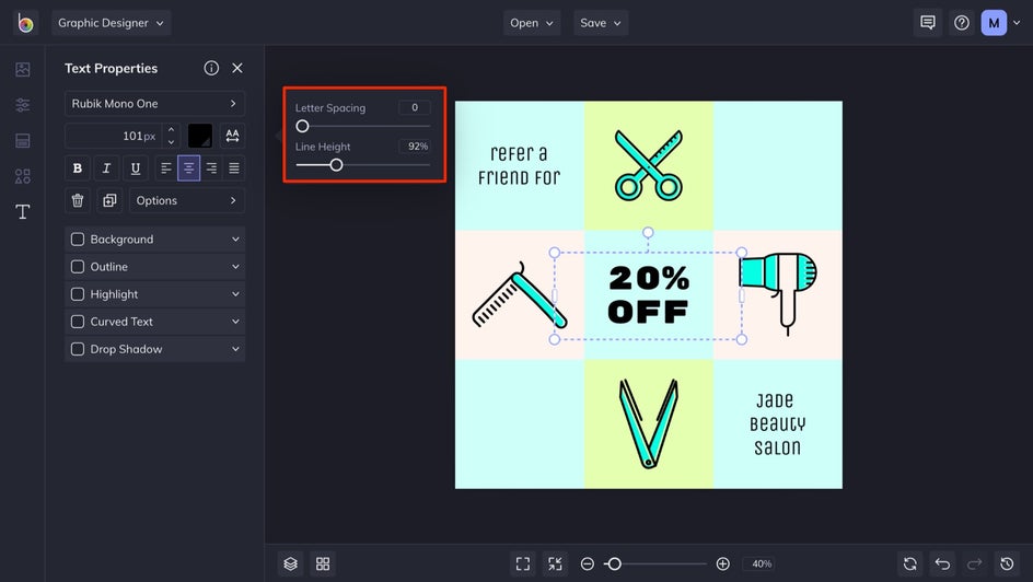
For this example, we've added a drop shadow and increased the opacity to 100% to make it look more like an angled outline.
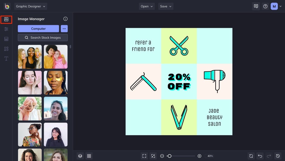
Step 5: Add Images
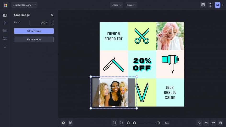
If you have images to add to your design, head to the Image Manager tab. Images can be masked directly onto your graphics and then adjusted by double-clicking the image.
Double-clicking on an image also brings up the Crop Image menu, with which you can adjust your image's location in the graphic.
Step 6: Save Your Design
Once you're happy with your design, click the Save button, found at the top of your canvas, followed by your location of choice. Saving it as a project is always a good idea. That way, you can make edits later or change some elements to easily transform your design into something new.
Create Original Designs With BeFunky
As you can see, all it takes is a few steps to create an original design from scratch. Feel free to head to the Graphic Designer to create your own from the Blank Canvas tab, or browse our Templates tab for a preset suitable for any project.
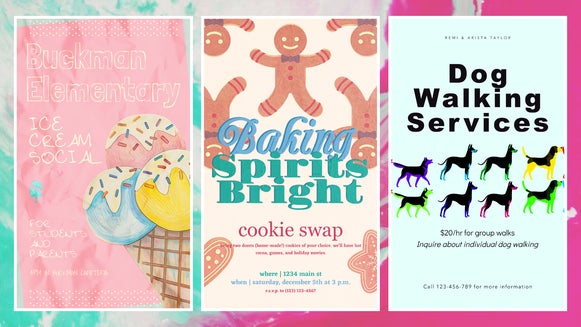
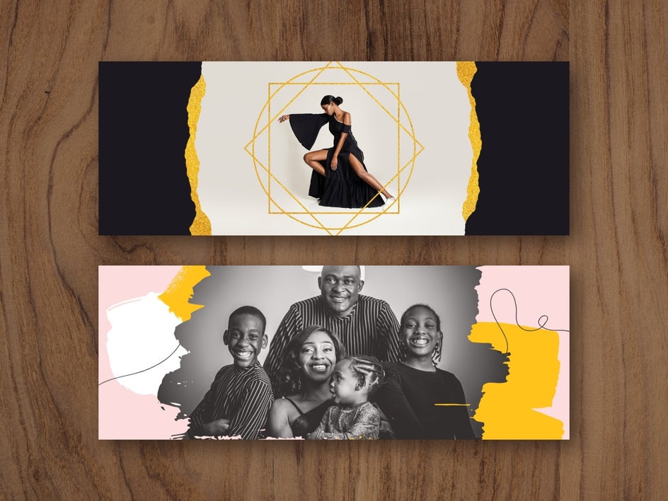
Graphic Design Inspiration
Here are some other ways you can utilize BeFunky's Graphic Designer to create original designs.
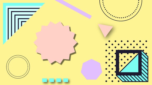
Graphical Backgrounds
Add graphics to the background of your design to frame the subject. You can go minimal with geometric shapes and lines, do something bold with abstract shapes, or choose something more specific to compliment your theme.

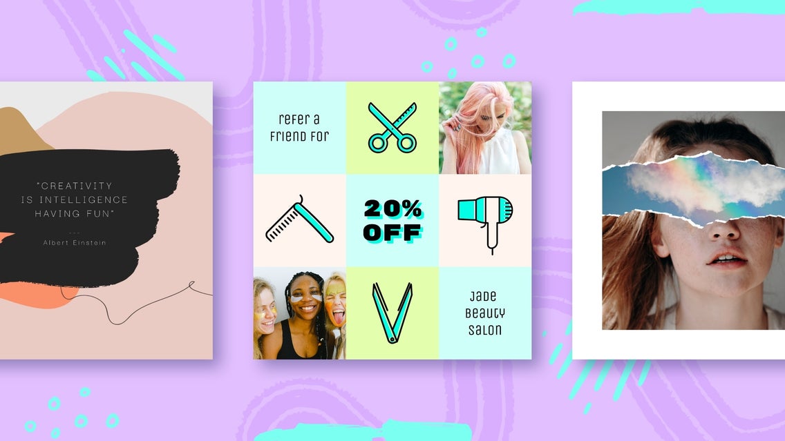
Masking
Masking your graphics is an easy way to add images to a design template or shape, without disrupting the flow and keeping things clean. You can also mask text to make it really pop.
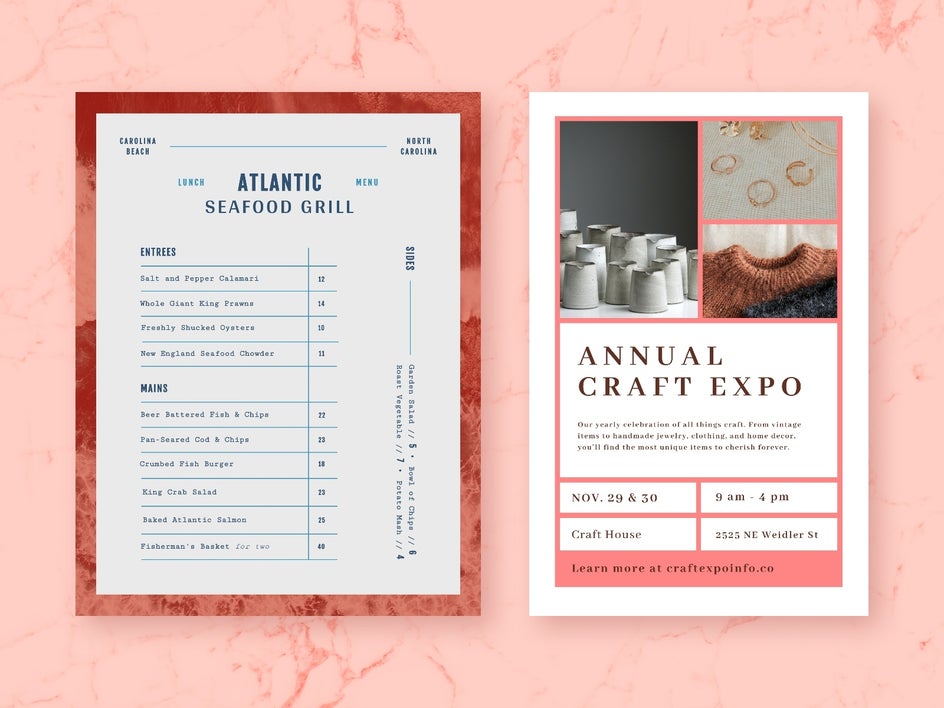
Lines and Strokes
Add lines and strokes to your designs to outline text, create brackets or menus, and organize other assets. Using these graphics is an easy way to organize designs that have a lot going on.