How to Optimize Your eCommerce Site for Better Sales
You’ve just put all of your time and energy into your marketing efforts, creating marketing campaigns and website ads to draw customers to your site. You’ve put in even more time creating posts for and managing your social media account in order to reach a wider audience and funnel them to your site. This is all great work, but if your website isn’t optimized for an easy shopping experience, then all of your efforts may be lost once they arrive on your website and click off because it’s either designed poorly or they simply don’t know how to navigate through it.

You’ve probably done this same thing before; you find a brand you really like and once you get on their website, you can’t for the life of you figure out where to find what you’re looking for. It is frustrating and we simply don’t have time to stumble through a website and opt to shop on a competitor's site that is designed better. Good for the shopper, bad for you.
Here’s the statistic: once you attract the right customers to your website, you now have 7 seconds to pique their interest before they click off of your website. The 7-Second Test helps you evaluate the functionality of your website and whether a new visitor would know what the website does and how to navigate to the area or page they need within the first seven seconds of arriving on your site. Visitors may even form an impression of your site in as little as 50 milliseconds.
5 Tips for Optimizing Your eCommerce Site
So, how do you optimize your site for a better shopping experience? With some of the tips below and by using BeFunky’s Photo Editor and Graphic Designer to create the right environment for the best user experience.
1. Create Eye-Catching Hero Images
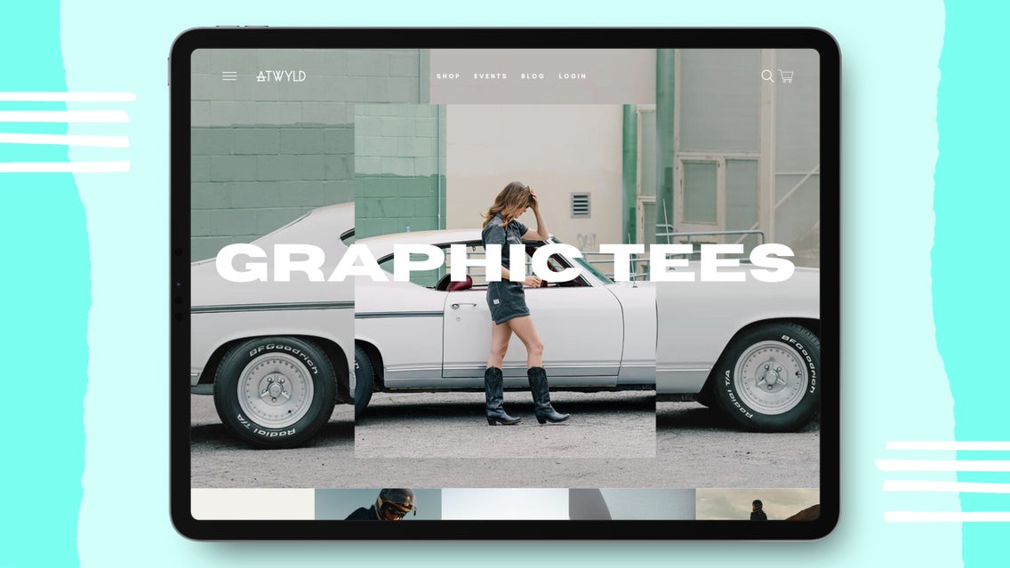
First and foremost, you need good imagery to capture the attention of someone coming onto your site. This can be done by creating an outstanding hero image. This image is usually the first thing a potential customer sees on your website and they create an immediate first impression from it. The more eye-catching the better the chances that your visitor will scroll through your home page or try to navigate to a page of their choosing.

You can also use some helpful manipulation techniques to get visitors to travel to the pages you want them to go by setting up your home page in a way that funnels them to what you are trying to sell more of. In order to do this, though, you need an eye-catching hero image to lure them into staying on your site and wanting to explore more.
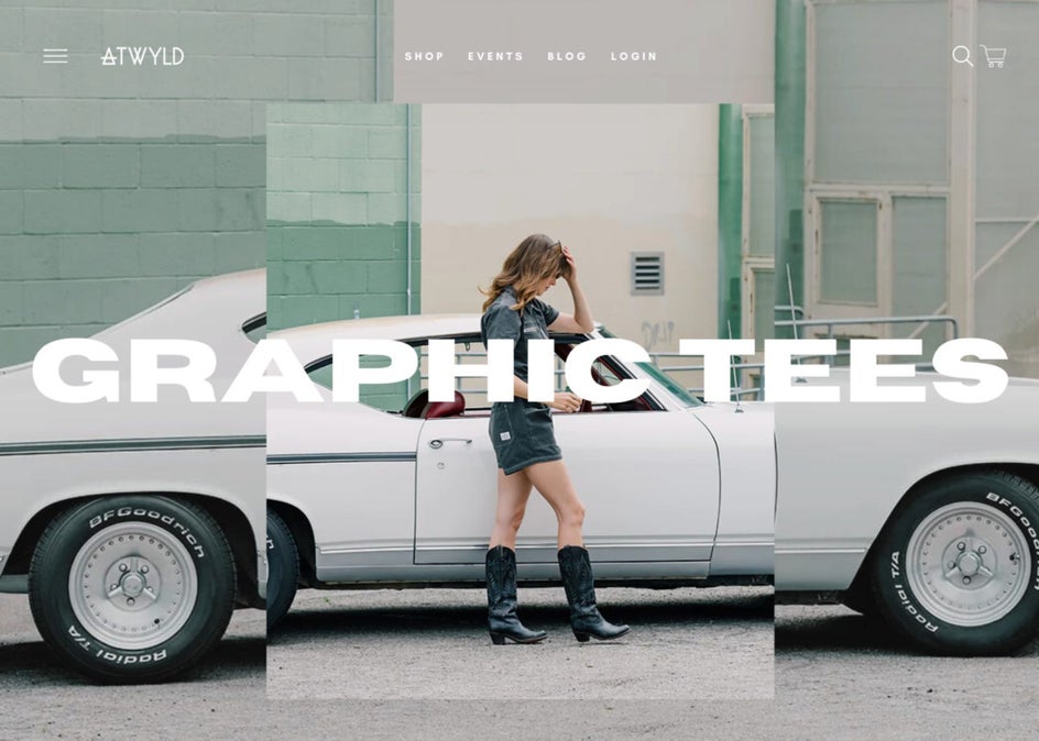
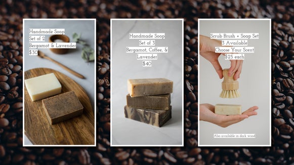
The other thing you are going to want to focus on within this same tip is to create eye-catching and clear headlines. You do not want someone guessing at any step of this process. Feed them what you want them to ingest. You must be clear and you must be concise. Is your hero image about graphic tees or boots? Adding text overlay to your imagery can help to clear up the communication and direction you are leading them.
2. Optimize Your Navigation
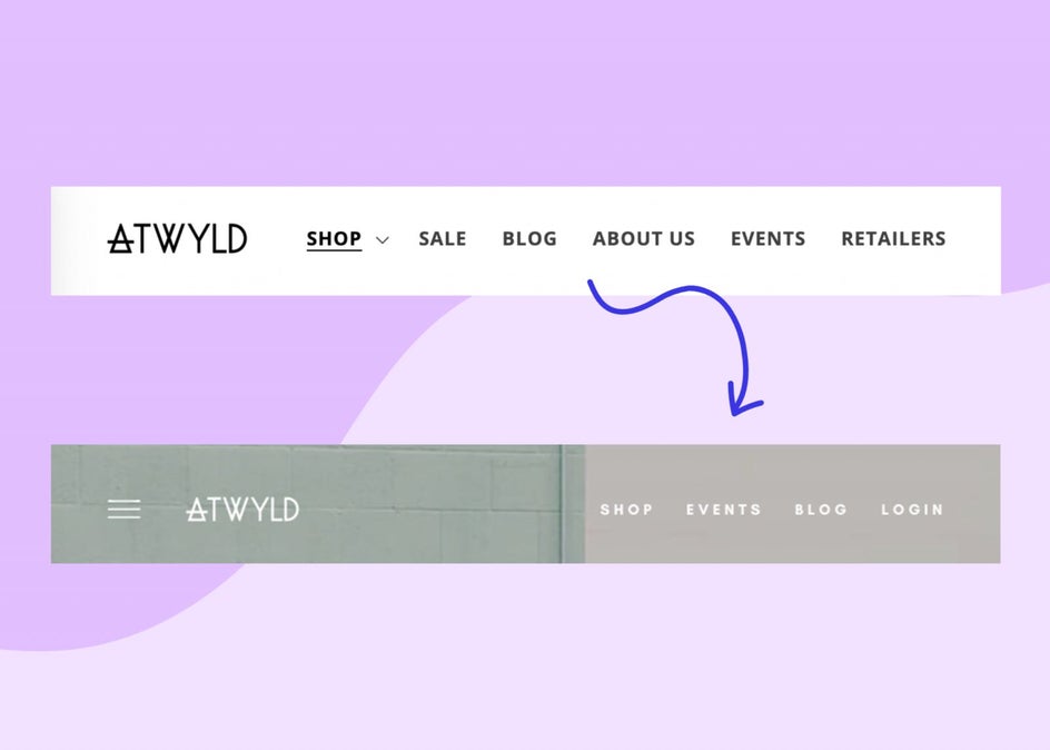
After you create the right kind of imagery, you need to make sure that your navigation is set up in the right way to help your visitor navigate to the pages they want to go to. Most of the time, navigation menus are filled with pages that can be accessed in the footer of your site and are completely unnecessary in your main header. If you put too many unnecessary items in your main navigation menu, it clutters the navigation and makes it more confusing for someone to navigate.
Ask yourself, what are your main goals for this site? If it is for a customer to shop your gear, then you want to set up your site to funnel them to those sorts of pages. Is there a specific product that sells really well for you? Then make sure you are funneling people easily to that product type or page. If you have a blog on your site, don’t just use it to tell stories, use it to sell your product and loop people back to purchasing the items your post highlights.
Once you have some of these questions answered, you then need to construct or optimize your site according to this system. It is a really similar structure to creating a sales funnel. Once the potential customer is on your site, you also need to create a funnel to get them to purchase. You can use these same strategies in order to do so.
3. Simplify the Copy to What’s Necessary
Your site most likely needs to go through a sifting process and this will most likely be with your website copy. This can be a difficult practice in general, to learn to speak concisely rather than give long-winded answers. Most of us can talk someone’s ear off if it is about a topic we are passionate about. You are most likely passionate about your product, its history, and the story behind the pieces - which is great, but these kinds of long-winded sections on your site do not translate well for sales. It only creates unnecessary text that most customers get lost in and don’t serve an actual purpose for a customer.
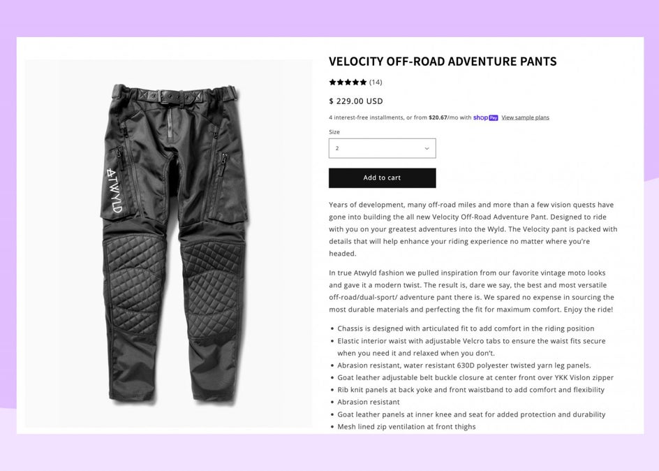
Start with your product pages. These are the pages that usually have the most copy. You want to cut it down to the basics. What is the product name, a short 1-2 sentence description, the important specs of the product, any sizing information, and that’s about it. If you want to write in detail about the product, you can include a link to a blog post about its history and construction, but leave it out of the product page description.
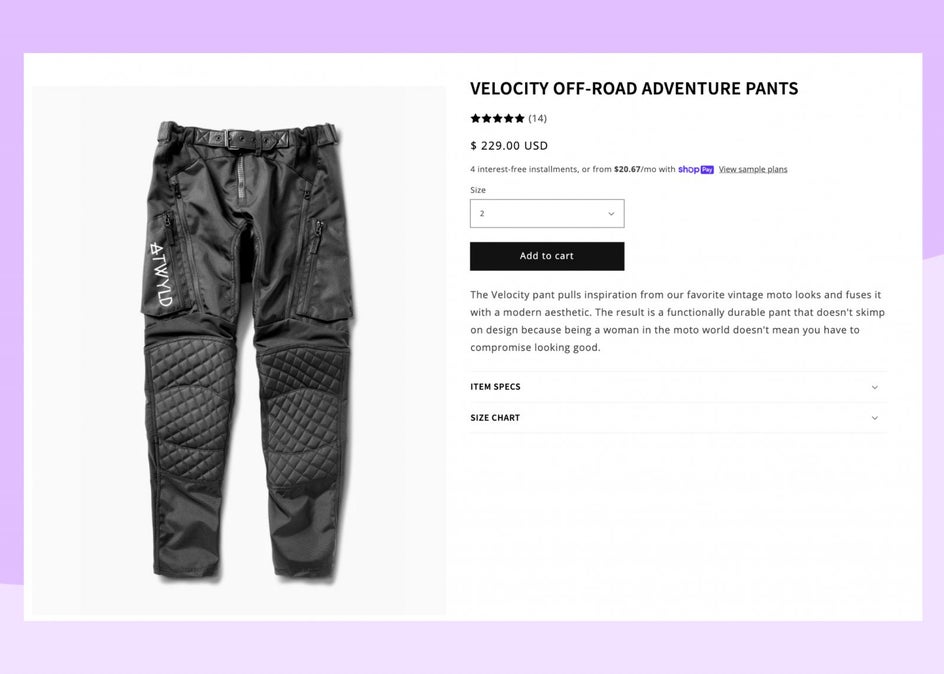
The copy on your website should be as short-form as you can make it. This is the same with social media. If you include multiple lines of text, people will generally only skim through the first line anyways. Again, we are spoon-feeding our customers what we want them to ingest. It has to be bite-sized for them to enjoy the process and want to take another bite. If you keep shoveling information down their throat it will be too overwhelming.
4. Check the User Experience Design (UX) of Your Site
Sometimes it can be difficult to have an objective perspective on our site when we are emotionally invested in it. In this case, it is good to ask for the unbiased opinion of others. You probably have a good amount of friends that would love to offer feedback on your site. If not, you can use your current audience’s feedback. People like to give their opinions, generally unsolicited, so imagine how they would respond if you asked them for feedback. This is one of the best ways to check the User Experience Design of your site.
You can create a survey maker with Typeform or Google Forms for them to fill out and even offer them a discount at the end if you’re having a hard time finding people! Once you get proper feedback, you can then design your site to be better optimized for what you know shoppers are looking for rather than shooting in the dark and guessing.
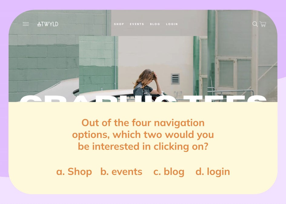
You want to ask questions like, “Out of the five navigation options, which two would you see yourself exploring naturally?” Make sure you are asking powerful questions that general powerful feedback. Asking simple questions like, “Did you like the site?” might be good to get general feedback, but you need some targeted questions in there as well. You might get feedback that you need to add more design for user accessibility. You might get feedback that your site is great and you don’t need to do many changes at all!
Experience also includes how your website looks overall. You want the website to function nicely and also be beautiful and pleasurable to navigate through. Making sure that your product pages are designed well and that your product images are clean, clear, and bright is important. If you are a product eCommerce site, take some of these tips on how to make your product shots look professional.
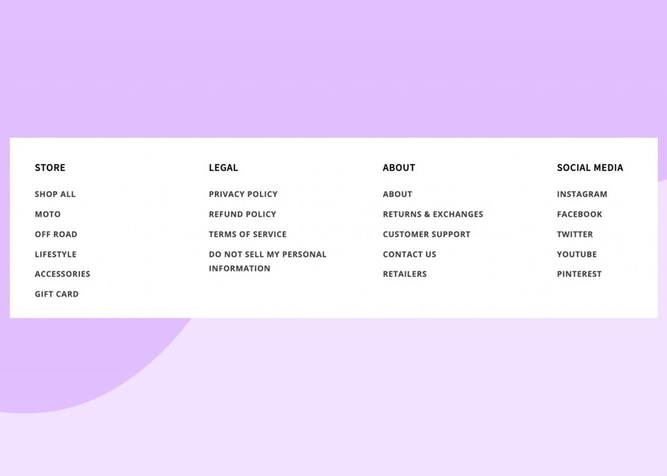
5. Make Sure the Footer Prioritizes Helping Customers
Anything that you felt you wanted to include in your main navigation can often be put in your footer. Your footer should be built out with helpful information such as store hours and an address if you have a brick-and-mortar shop, retailers if you sell in stores, return policies, customer support, etc. Most people want to put these items at the top of their site, but this is not generally the first thing someone wants to do on your site and if they do need help, they know to navigate to the footer for some answers.
Optimize Your eCommerce Site to Boost Sales
When you follow these tips above, you are optimizing your website. Any time optimization happens, simplification follows, and it creates a better environment for someone to navigate through. When you are ready to update your product shots or imagery, BeFunky’s Photo Editor, Graphic Designer, and Collage Maker are ready to help you create the best website for your business.