Designing Your Website for User Accessibility
Designing a website as a new web designer can be quite difficult, as there are so many crucial things to consider. When building a site, it is important to keep in mind a user's interaction and experience with the site. This is called UI (user interaction) and UX (user experience) and is very important in order to keep traffic coming to your site. The reason that this is important is you have seven seconds to make your first impression. If a user is not drawn in visually or cannot immediately locate the information they came to your site for, they will click off.
A trend that is coming quickly to the creative front is creating product and web experiences that are tailored to those with disabilities. Unfortunately, this has been a market that was previously overlooked in the past, and with a rate of One in four adults in the U.S. having some type of disability, it is time to make adjustments in order to create a more accessible online environment. Web accessibility means that people with disabilities can equally perceive, understand, navigate, and interact with websites and tools. In short, if you’re not optimizing your content to be accessible, you’re losing engagement and sales from a large population of people who can’t access your product or service.

When creating a website, you should be considering disabilities such as blindness (including color blindness), deafness, and ADHD among many others. We will go into several accessibility solutions for each of these so that you can create an amazing-looking website that also includes accessibility features.
Website Examples for User Accessibility
It isn’t hard to create a website for accessibility once you know where to start. We will go into several accessibility solutions for each of these so that you can create an amazing-looking website that also includes accessibility features.
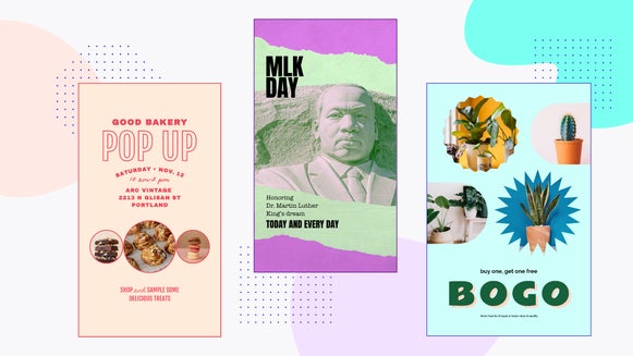
1. Minimalistic, Bold Colors
In the past two decades, websites were very minimalistic. Now, with color coming onto the design scene, there is a mixture between creating minimalistic designs but with pops of color. Depending on which way you want to swing, it is important when designing your site to use colors that have high contrast.
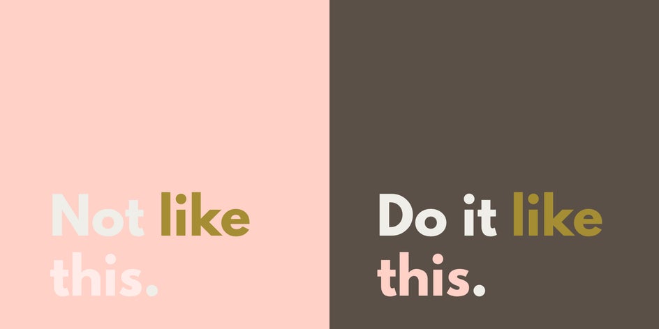
This helps users with color blindness and ADHD to more easily focus on the important parts of your site. Color should be used as a technique to enhance text or sections that are important. You can check your contrast with this tool.
2. Create Descriptive Titles
Creating descriptive titles helps everyone. Titles should explain what the section is about. Within our heavily-saturated marketing culture, people like to create titles that are catchy but have nothing to do with their current product or feature. This makes it extremely difficult to find what you need on a page, especially if you are navigating one blind.

Not only does this help make your website accessible, but it can also help with your website’s SEO (search engine optimization). By including popular keywords or phrases in your titles, you can increase the likelihood that you will be searchable.
3. Keep the Copy Short and Sweet
When your site has a lot of copy, it becomes very difficult to find what you’re looking for. People get easily lost in text and most people don’t want to spend their time reading through lines of information. Remember, you have seven seconds to draw someone in.

When it comes to text, the simpler the better. Body copy should be bite-sized pieces of information given to your audience so that they get enough information but will inquire further if they need to. You want to communicate the clearest message in the least amount of words. Do this each time with some creative quips and your copy will be brilliant. Not only does this help users of all kinds but it especially helps those who are blind or use screen readers to navigate a website.
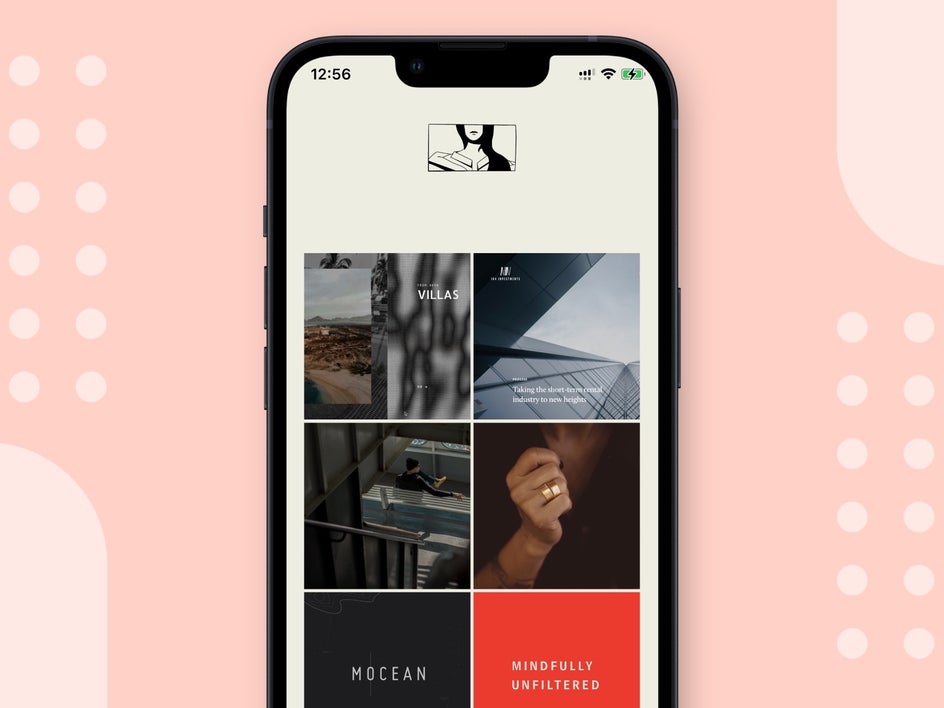
4. Use Images to Break Up Heavy Text
If you need to create a page with long-form copy, make sure to break it up into easily digestible pieces with photos in between.
Photos help to keep the eye’s interest when there is a lot of text around. It helps to break up the page so that it can be taken in a slower manner.
5. Simple Typography Is Best
Minimalistic typography has been king over the last decade. But with vintage inspiration coming back into the typography world, script fonts have been the new trend. So how do you achieve this look while also keeping your site accessible? There are two ways to do this.

First off, make sure that your sub-headers and body text are easy-to-read fonts. These will usually be a variation of sans-serif, but there are some great serif fonts that work well as body fonts. The second way is to be mindful of font pairing. This simply means choosing fonts that pair well together and balance one another out. You can read more about that here in our Ultimate Guide to Font Pairing.
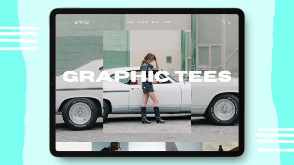
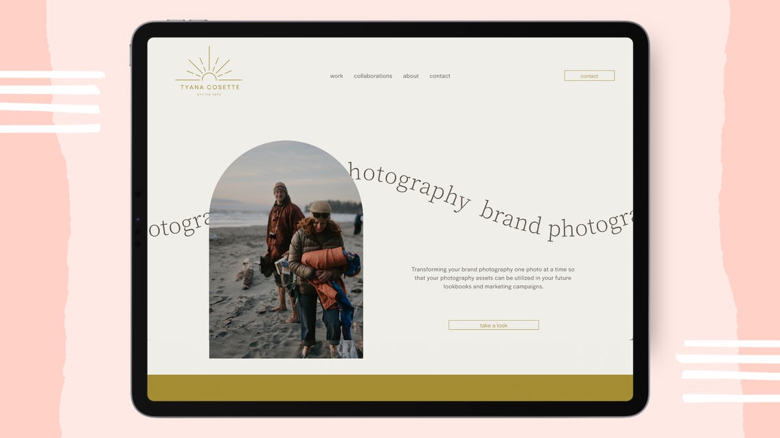
6. Use Animations Sparingly
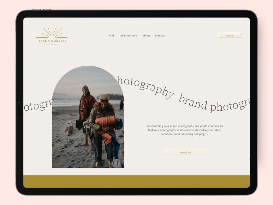
Animations in web development are a popular trend, but it is important to know when to use them and when not to. Scrolling animations can be good like on Poppi’s website. But pages that include continually moving visual animations can be difficult for users with ADHD to focus on finding what they are looking for. Minimally scrolling text like on Tyana’s website is okay, but make sure that it isn’t flashy and that you use this sparingly!
Creating Websites With User Accessibility in Mind Is the Future
Taking the time to create a website for yourself or your business is a huge feat! When you follow these simple steps, it becomes easier to create an accessible website for users who could truly benefit from it.