Top 5 Beginner Graphic Design Tips
When starting a new hobby or career it is oftentimes difficult to know where to begin. People give you all sorts of advice and tips that it can be overwhelming to simply start. I have always found that it is so helpful to hear about the basic essentials for success from an expert in their field.
It seems like everyone these days is going to school for graphic design in some form or fashion and as a designer, you can tell when another designer is either new or unskilled in design because there are basic principles that every designer follows. These are things that you will inevitably figure out over time, but with BeFunky’s Graphic Designer and these design tips, you can gain the necessary tools to start off on a good foot.
Where to Start as a New Graphic Designer
Not sure where to start? Here are a few suggestions that come from my personal experience – so that you can start your design journey with direction and confidence.
Choose a Theme
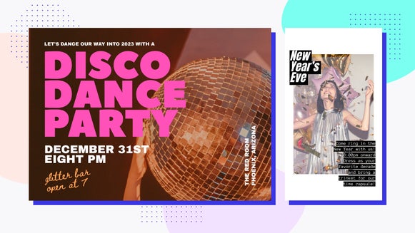
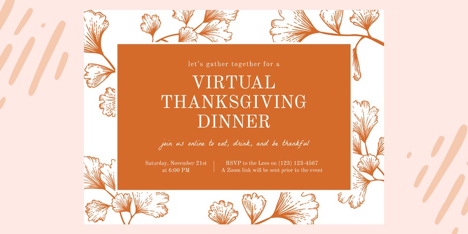
Choosing an overall theme is very important when beginning any sort of design. Do you want it to be pop-art, minimal, retro, or rustic? Once you have a theme, then you can choose design elements that support this theme. If you do not start with a theme, you risk complicating your piece with many different aesthetics that are not cohesive. When you create a design that is not cohesive, it causes confusion, and people have a difficult time staying focused long enough to draw out the message you are trying to communicate.

Choose a theme and then choose elements that are in alignment with that theme. If you have a minimal theme, use thin lines, hollow design elements, minimal color, and sans-serif typefaces. If you are creating a rustic piece, use large scripted typefaces with texture, add a wash of texture to your background, and use toned-down colors.
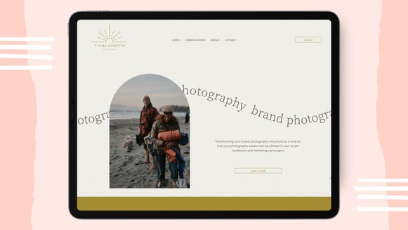
This tip is especially important when you are a business trying to market material on your social account for an upcoming sale or campaign. Because so many people are being bombarded with information on social media, it is important to choose a theme for your sale or campaign so that it is easily recognized throughout the duration of your marketing campaign.
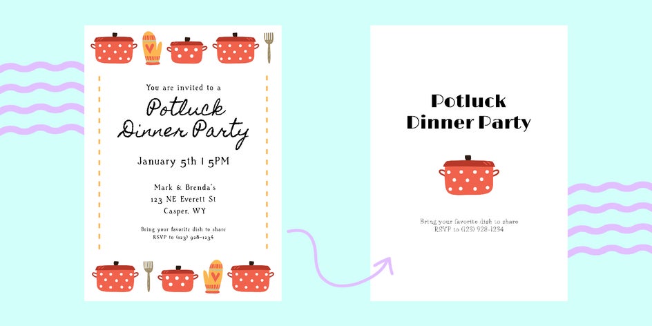
Keep It Simple
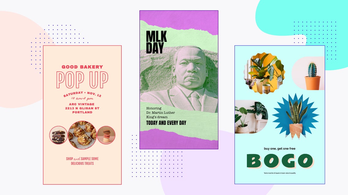
It is tempting with design to showcase all of your design interests in a single project. Whether it be a poster, logo, or a simple postcard - the draw to include many different typefaces, colors, and design elements is strong. This can create an overwhelming piece and your message can become easily misconstrued. The best design is usually simple, has a lot of white space, and gives breathing room for each element. The goal is to manipulate your audience’s eye movement to easily move to the most important part of the design, without getting hung up or ping-ponging around the entire piece.
As a general rule for communication, it is best to form your thoughts and then simplify them down to the most concise message - this is the same for design. Communicate all of the necessary information and eliminate the rest. So, as a general rule for both visual design and visual communication: the simpler, the better.
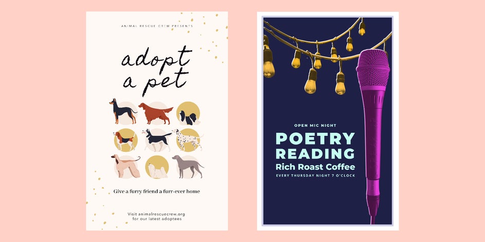
This rule is helpful when you are creating posters. Many times, people add such a vast array of design elements in a single poster that it is hard to decipher the overall message and also pull out when and where this event may be happening. Keeping posters simple, with a main design element, and only the necessary information on it is so incredibly important. You will also notice that if your design element is cool enough, people will want to hang your poster even after your event is finished! When an ad becomes art, it truly shows your design expertise.
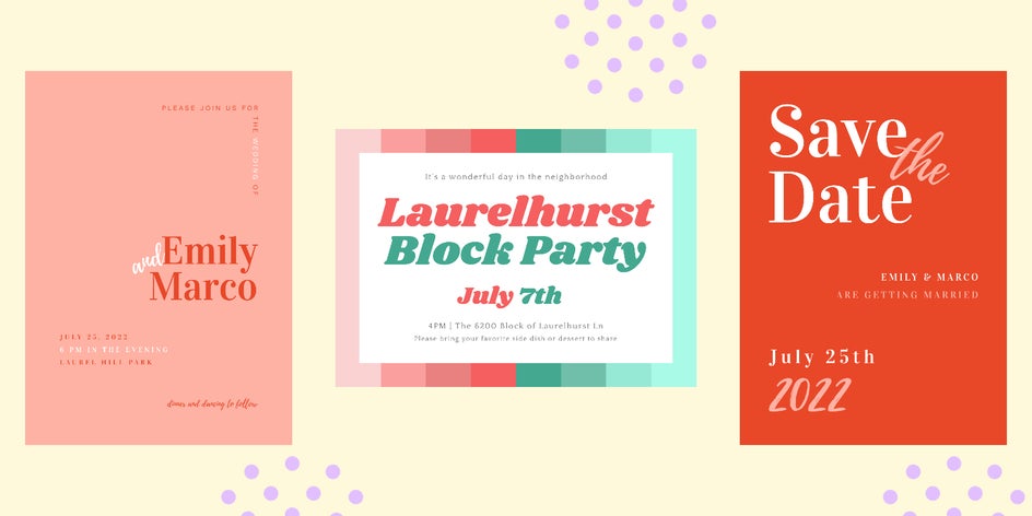
Hierarchy Is King
There are many different types of hierarchy within design. We are going to discuss two main things. There is a hierarchy of all the different design elements, as well as text and typography.
With design elements, you want to have a central design element and then supporting design elements that do not take away from the main element.
With text, you want to have a header, sub-header, and body text. The header should be the biggest or most distinguished element on the page, while the sub-header and body text being smaller. Something to note is that it is important to choose multiple typefaces that pair well together, but we will cover this next!

This is important within your branding elements in order to communicate your messages in a simple format. You will notice that you use this structure in every element of your brand assets including your website, business cards, posters, and social media assets.
Choose the Right Typography
Not only is structuring the hierarchy of text blocks important but so is choosing the right typography for each of these.
Firstly, choose typefaces that are consistent with the overall design aesthetic you are wanting to achieve. Don't create a pop poster with a western typeface. Try to be cohesive with what your typeface is communicating compared with the overall design. It helps everything flow together with a consistent look and theme.
Once you have your main typeface chosen, choose up to two other typefaces that pair well with the main one. This is called font pairing. As a rule of thumb - you do not want to use more than three typefaces total. Keep it to two or three. If you need help finding other fonts that pair well with your main one, check out our Ultimate Guide to Font Pairing or you can always do a quick Google search “[FONT NAME] font pairing” to see examples of other fonts that work well with your main option.
Pick a Color Palette
Picking a color palette is oftentimes ignored – and it is such a shame, because this option alone can shift a piece in such a drastic way. Over the past 20 years with minimalism reigning in design, people have stripped color from their designs and kept it to black, white, and gray. But we are entering into an era of color, and in my opinion, we are better off for it.
The thing with color palettes is that you don’t always have to choose colors that go with your overall design. You can, and it would make it the most cohesive, but let’s say that you were creating a western poster and decided to use earth tones with an added element of hot pink in there. Color, I feel, is meant to be utilized as a fun and unexpected addition to a piece. Try to figure out where you can utilize an unexpected color and weave it into the harmony of your overall design. If you want to get deep into color, check out this article on Color Theory. Also, with BeFunky’s Color Management feature, you can create and save color palettes directly to your profile for easy access on any future project. This makes creating color palettes easier than ever!
Use Inspiration, But Stay Original
There is a ⅔’s rule that you should follow in design. You must change an inspiration piece you are drawing from at least ⅔ in order to call it your own design, otherwise, it is design plagiarism. What I do is find a few different pieces I love and pull a single element from each of them. I might like a color here, a typeface there, and a design element on the last one.
You will find that after designing over a period of time, your design style will begin to emerge. This is the best feeling – when you start to see a cohesive style you are drawn to, and others can recognize it simply based on seeing it for the first time. The goal is to be unique.
Break the Rules
In all of my experience working within the creative industry over the last decade, some of the coolest pieces I have seen and some of the coolest themes that have emerged have broken all of the current design rules of that time. We like to create rules in order to create boundaries and clear communication, but sometimes breaking those rules works best for what you’re trying to communicate. Take, for example, creating a punk rock poster. Create the main header with ten different fonts for each letter. This is breaking the type rule, but it works with the chaotic randomness of that design style.
Get Started With These Basic Graphic Design Tips
There is a lot of information above to get started with. Open a new project in BeFunky’s Graphic Designer and go down the list above, choosing a theme, a message, design elements, and colors that communicate the message you are trying to portray.
Design is a fun way to communicate through visual means. Over time you will see your design style emerge and you will notice yourself pushing past certain rules that once were there. The goal is to create and also explore new avenues of design.