6 Simple Editing Methods for Photo Color Correcting
Do you ever look at a photograph you’ve taken and think that the colors are off, but you can’t quite pinpoint what’s wrong? Maybe there are too many colors going on, or too few, or clashing hues. Maybe the colors don’t fit the mood of your photo. If you sometimes struggle with color in your photography, you’re not the only one. Color theory is complex, and creating a final result with a good, cohesive color palette can seem like the luck of the draw.
Fortunately, there are tons of digital shortcuts to creating harmonious colors in your photography, even if the piece is already “complete,” and even if colors aren’t your strong suit. There’s no need to scratch it all and start over: Just open up the online Photo Editor and use one (or more!) of these 6 simple color-correcting methods.
Do These Colors Look Good Together?
The great thing about using the Photo Editor to adjust the colors in your photography is that you can play around with the settings as much as you’d like until you’re happy with the result. As a creative, you can and should trust your instincts! But if you really want to be sure your colors go together on a fundamental level, you can check out this article to learn a little more about color theory. Much of this info doesn’t just apply to design, but to photography as well.
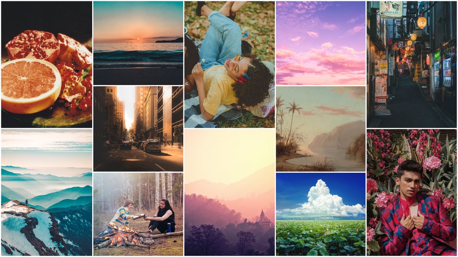
One good way to get better at colors is to build your visual library using the work of experienced artists and photographers. Simply scroll through Pinterest, Google, a curated blog, or an archive like the National Gallery of Art. Save the images that you’re attracted to for their colors. Upload these to the Collage Maker for an amazing inspiration board that you can reference when you’re unsure of what colors to use!
Remember, color is just one part of what makes a great photograph. Other vital elements include light and composition, so make sure you’re paying attention to these as well.
How to Edit Your Photos for the Best Colors
Ready to transform your photos? Just open up the Photo Editor on your desktop browser to get started!
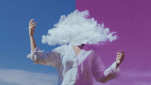
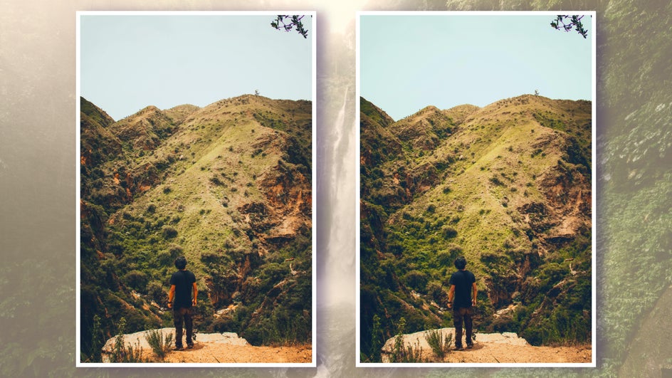
Method 1: Adjust the Temperature
Temperature refers to the “warmth” (red, orange, and yellow tones) and “coolness” (green, blue, and purple tones) of your photo or drawing. To use the Temperature tool, just go to the Photo Editor’s Edit tab and click Color underneath the Essentials. Here you’ll find the Temperature adjustment slider alongside the Hue and Saturation tools.
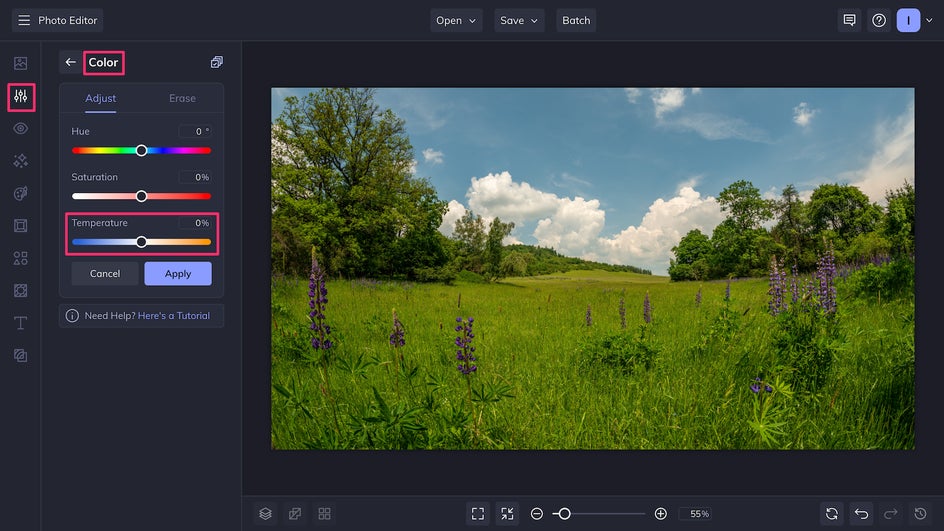
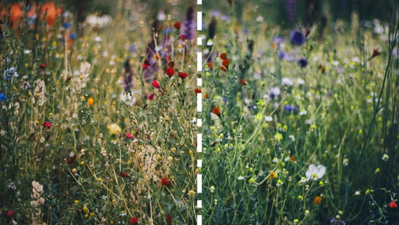
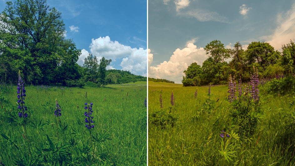
Adjusting the temperature is a quick fix for colors that feel almost right, but not quite. It can completely change the mood of a photo:
Or, it can balance out an image that’s too warm or too cool to begin with, making the colors look more natural.
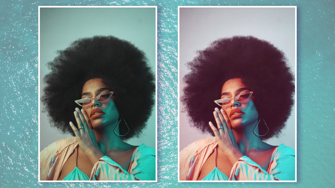
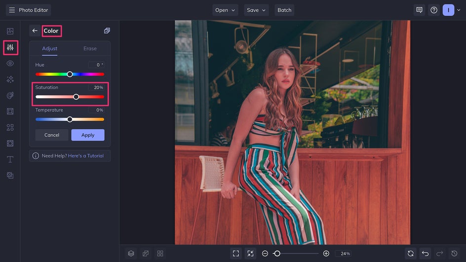
Method 2: Adjust the Saturation / Vibrancy
A common method of combatting dull colors in photos is to increase the saturation, or color intensity, which you can do with the Saturation slider found with other color tools. This works great for making small adjustments.
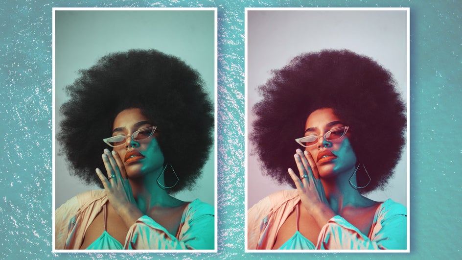
However, if you’re starting with a photo that doesn’t have too much color to begin with, or is high contrast, this method can easily lead to your image looking unnatural and oversaturated. In these cases, you can use Vibrant Colors DLX to make the photo look naturally vibrant! This tool is found under the Color Enhancements section of the Edit tab.
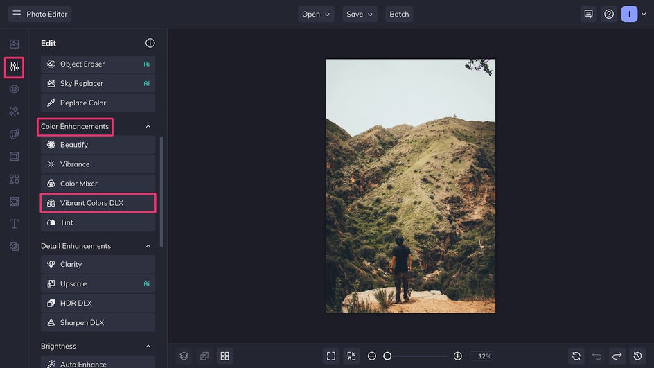
Vibrant Colors DLX enhances colors while balancing out the typical over-saturation that occurs with skin tones and warm hues. Just look at the difference between the lefthand image, which was edited with the Saturation tool, versus the righthand image, which was edited using Vibrant Colors DLX.
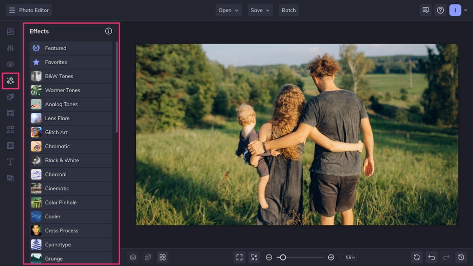
Method 3: Apply an Effect
BeFunky has Effects of all kinds that serve as one-click filters for your photos and art. You can find them in the Effects tab on the left-hand side.
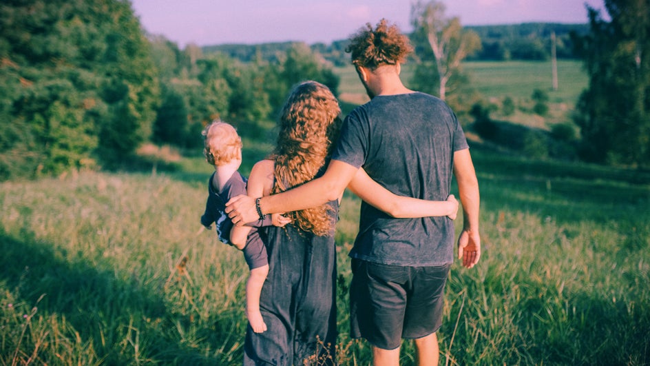
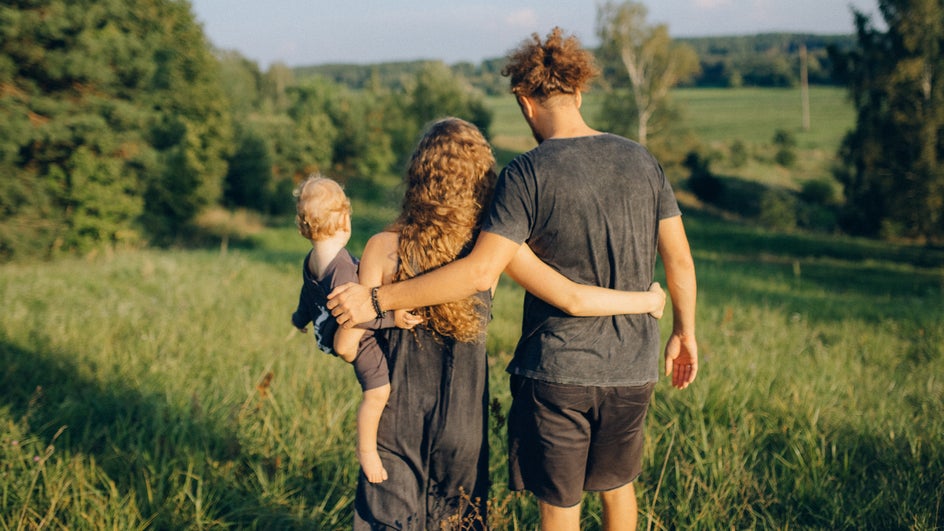
Many Effects are designed to adjust your image’s colors to change the tone or make it look more cohesive. Below is the Chromatic 9 Effect.
Some particularly helpful options for adjusting your colors are Analog Tones, Warmer Tones, Chromatic, Color Grading, and Instant. How they affect a photo depends on the colors of the original image, so feel free to play around with various Effects before you apply them! For instance, Warmer Tones is actually used to make the photo below look colder and starker.


You can use Effects at their default settings, but many also allow for customization so that you can fine-tune your photo’s colors as much as possible.
Method 4: Use the Color Mixer
The Color Mixer is the equivalent of what you may know from other photo editing platforms as the “Curves” tool. This allows you to choose how much red, green, or blue is in your photo.
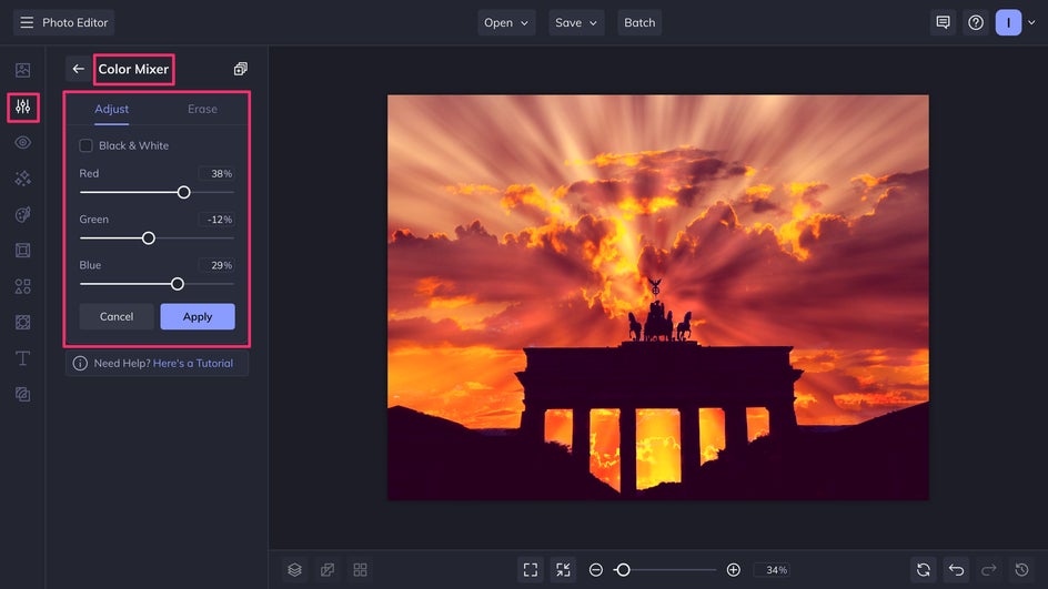
The Color Mixer lets you completely customize your image’s colors to your liking. Here we’ve increased the red, increased the blue, and decreased the green in the image for more intense contrast.
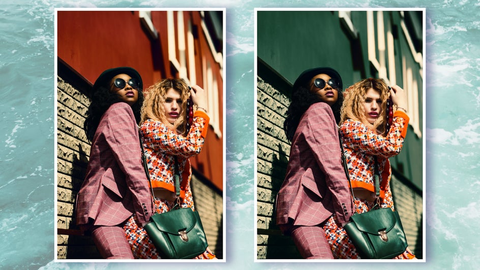
Method 5: Replace a Color
What if you have a photo with a nice composition and great colors for the most part, but something is throwing it off? If there’s a color in your image that’s bothering you and you don’t want to change the whole image, you can just use the handy-dandy Replace Color tool to switch out a single color.
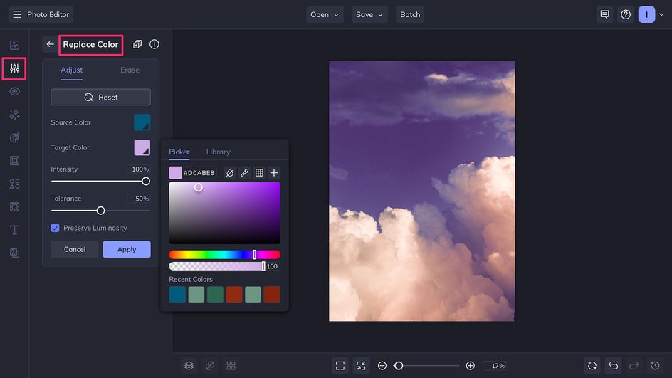
For instance, here we’ve changed the color of the wall behind the subjects so that it doesn’t draw so much attention away from them. The color we replaced it with matches the subject’s purse and makes the overall image more cohesive.
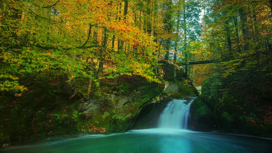
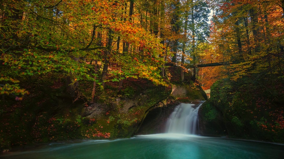
Method 6: Blend
Blending allows you to add a layer of color that can tie your whole photo together. Essentially, all you have to do is add a solid color image as a Layer on top of your original photo. How this blending layer interacts with your base layer depends on what Blend Mode you choose, such as Overlay, Soft Light, or Hard Light.
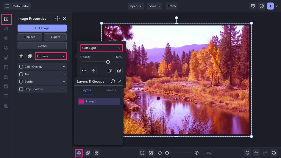
Here’s an article on all the different types of Blend Modes and how you can use them. Below, we’ve added a blue-green gradient layer on the Vivid Light blend mode to create a fantastical, dreamlike setting.
Make Color Correcting Simple With BeFunky
Making colors look balanced and cohesive in your photography doesn’t need to be a challenge. Using the Photo Editor, anything is possible: You can soften colors, even out a palette, increase vibrancy, and even replace entire colors. Simplify your editing process and step up your colors today by uploading an image to the Photo Editor!