How to Use Monochrome in Your Design
Using a monochromatic color scheme can create a beautiful effect that forces the eye to focus on the subject. Monochromatic styles are used in graphic design, interior design, and fashion to create peaceful harmony or bold disruptions. Monochrome designs especially stand out online making viewers stop scrolling and pay attention.
What Is a Monochrome Design?
A monochrome design uses one base color and then adds tones, hues, and shades of that same color to create contrast so everything in your design does not just fade together.
BeFunky offers amazing tools for various monochrome design ideas and projects.
Let’s dive into the BeFunky Graphic Designer to try out some ideas.
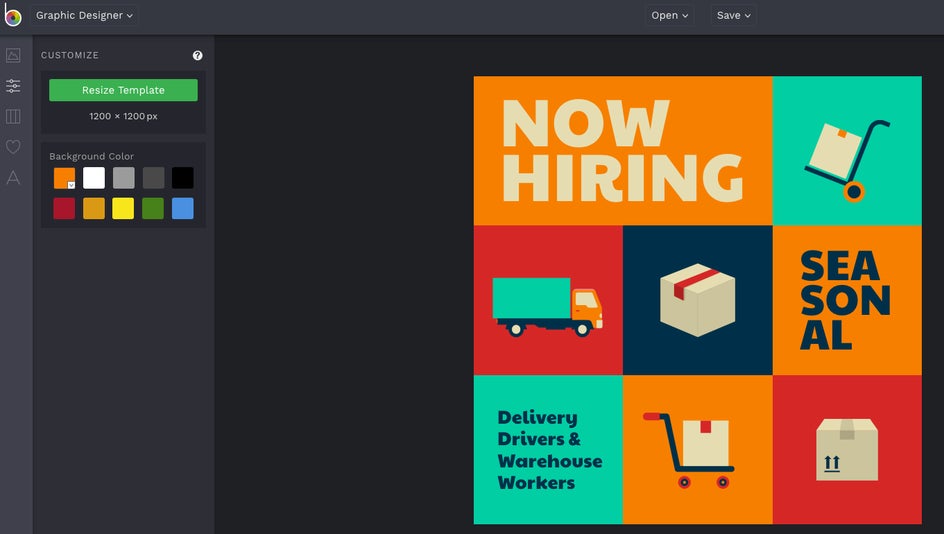
I have chosen an Instagram Post Template with various color blocks so we can see how the design changes with a monochrome color palette.
How to Create a Monochrome Design
Step 1: Pick the Base Color
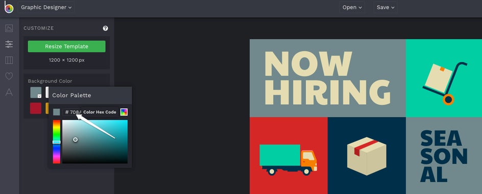
First, we will want to pick the base color. To do this, go to Edit > Customize > Background Color. If you are creating a work project, you can stick to your brand style colors. For this particular design, let’s choose a 2021 Trending color, Benjamin Moore’s Color of the Year: Aegean Teal with a HEX code of #708A8C.
After clicking the down arrow on the orange box, I copied and pasted the HEX code into the color palette.
Step 2: Experiment With Color Variations
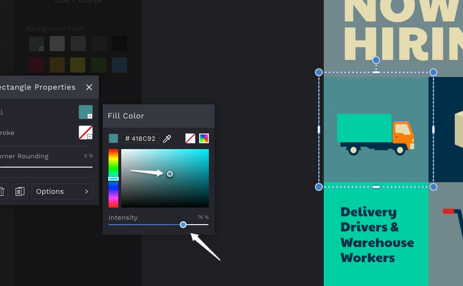
Now we have a base color to work from. So let’s play around with variations of this color for the other boxes.
We can do this by clicking on another color block, putting in the HEX code, and then dragging our cursor around for varying shades going brighter or darker. We can also vary the shade by changing the intensity.
I continued this process for each of the color blocks by simply clicking on each element. Once all the blocks are in our Aegean Teal color palette, we can change the elements and text to fit the palette also.
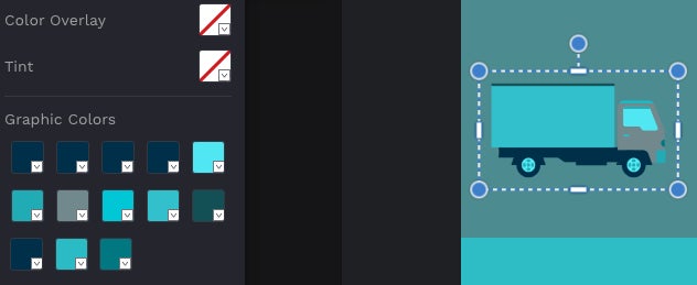
If there is a shade we like from one element or block that we want to repeat, we can use the Eye Dropper tool to grab the color.
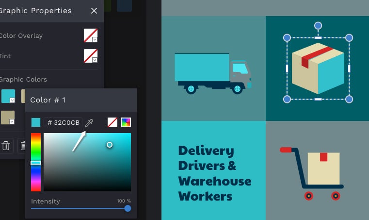
Once everything is in our monochrome palette, we can see that everything stands out, but the graphic as a whole is cohesive. This can be a powerful branding move.

Monochrome Inspiration
Now that we have an idea of how this can work, let’s look at tips for creating a powerful monochrome design and get some more monochrome inspiration.
Tips and ideas to try:
- Go bold or go minimal
- Add patterns and textures for more interest
- Try a progression or ombre effect
- Play with greyscale
- Leave white space
Some great ways to use monochrome colors are for social media posts, gallery walls, and photo collages.
Social Media Posts
Going for a monochrome effect can simplify complicated graphics like infographics and can help even simple graphics stand out in a busy social media feed. You can even base your whole profile on Instagram around a monochromatic theme for a unique look.
For this example, let’s use another trending color. This one is from Pittsburgh Paint Company and it is called Big Cypress. The HEX code is #B98675. We can even change the photos to match. Select the photo you want to edit and then click Edit Image.
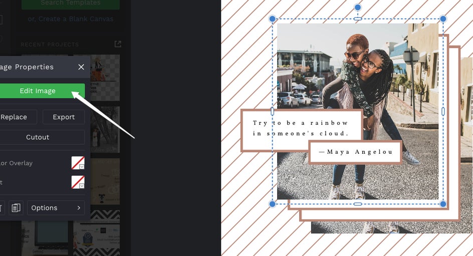
Head over to Tint. Put your code in at Color Value 1. You can adjust the opacity if you would like the color effect to be less intense.
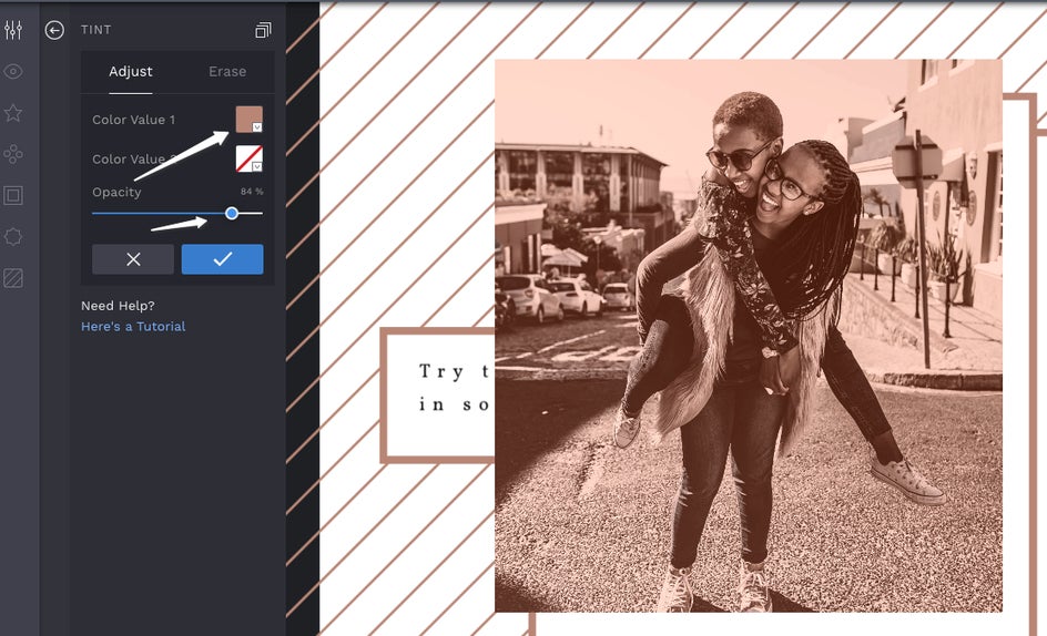
Then click Done Editing Image. Following the same process for the background image. Here is the final result:
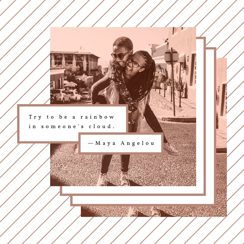
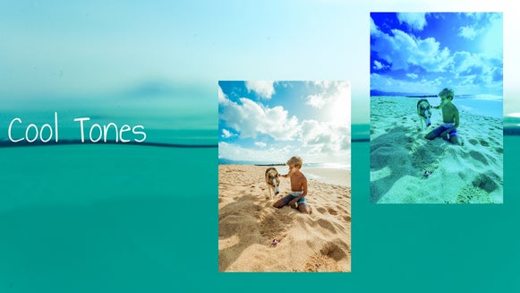
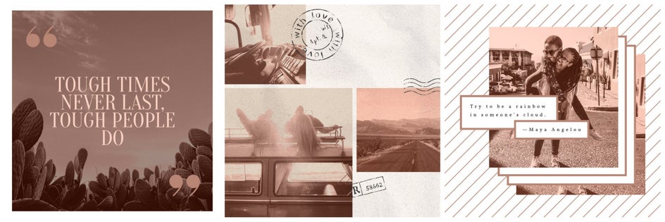
How would an adventurous Instagram feed look using a monochromatic color palette, white space, and texture?
Something like this:
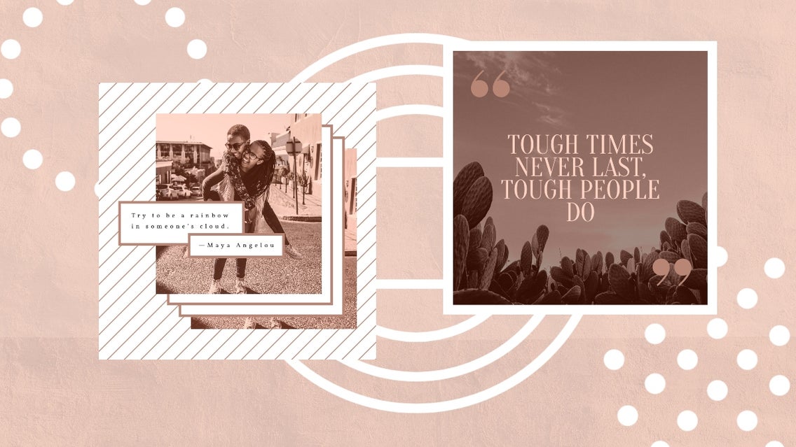
Gallery Wall
You can unify a gallery wall of mixed quotes and images by sticking to one base color and varying the shades and tints. The images in this gallery wall have been edited to a Serene Green #163311 with some wood tones added to go with the clock.
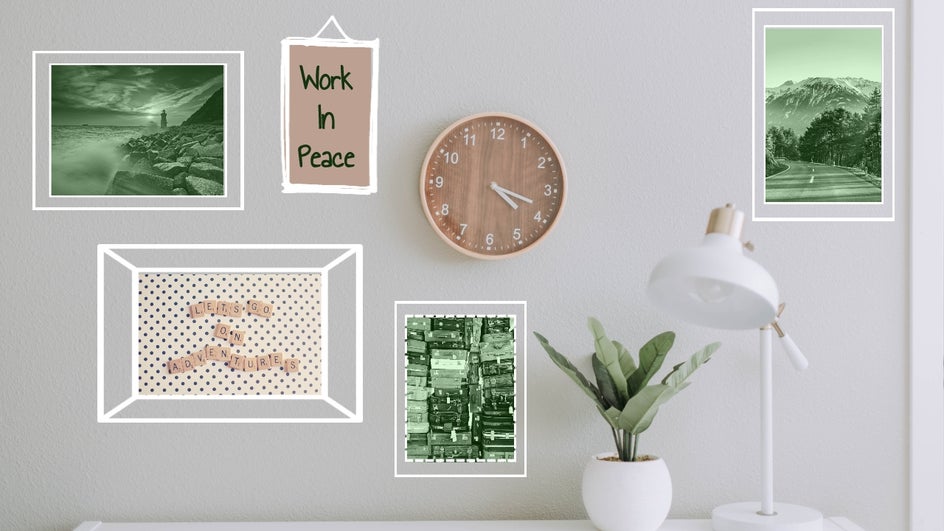
Photo Collages
Whether for personal or business, photo collages are a beautiful way to share your memories and engage viewers.
Let’s try a black, white, and greyscale version.
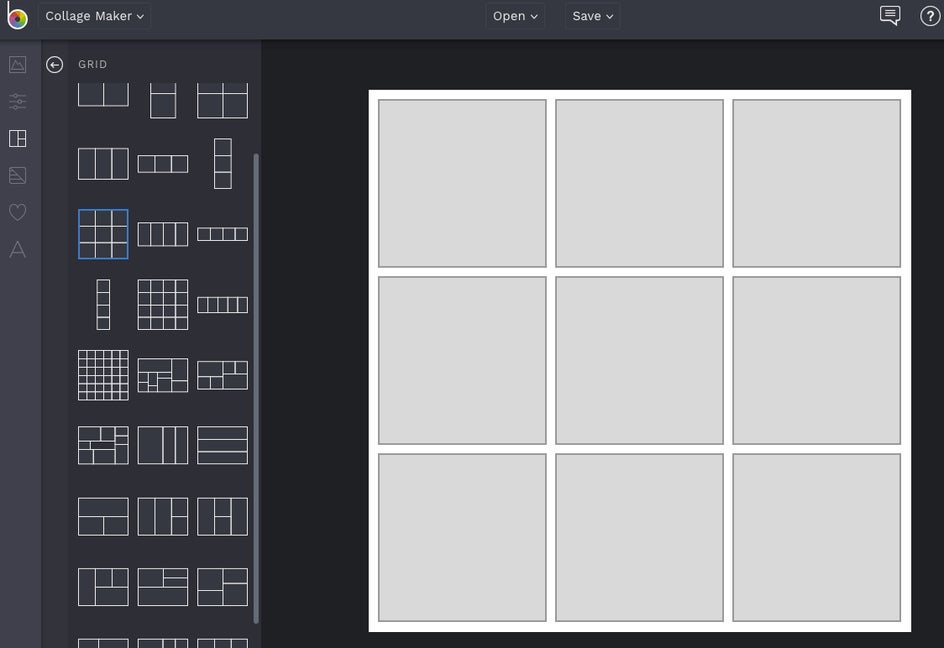
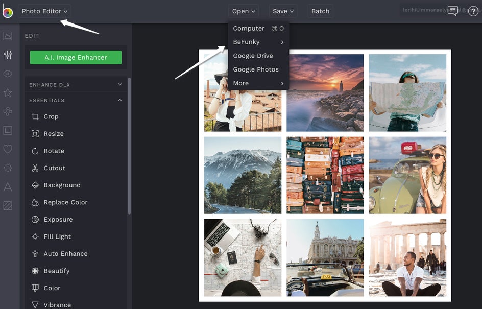
In the BeFunky Collage Maker, we’ll open a 6 cell grid and put in our photos.
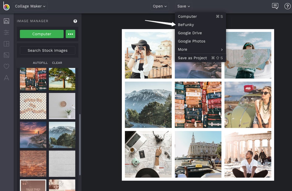
In this example, I will be going with a travel theme. Once you have your images in the grid, save the project to BeFunky.
Then open BeFunky Photo Editor and find your collage. We will work here so we can edit the whole collage at once, rather than each individual photo.
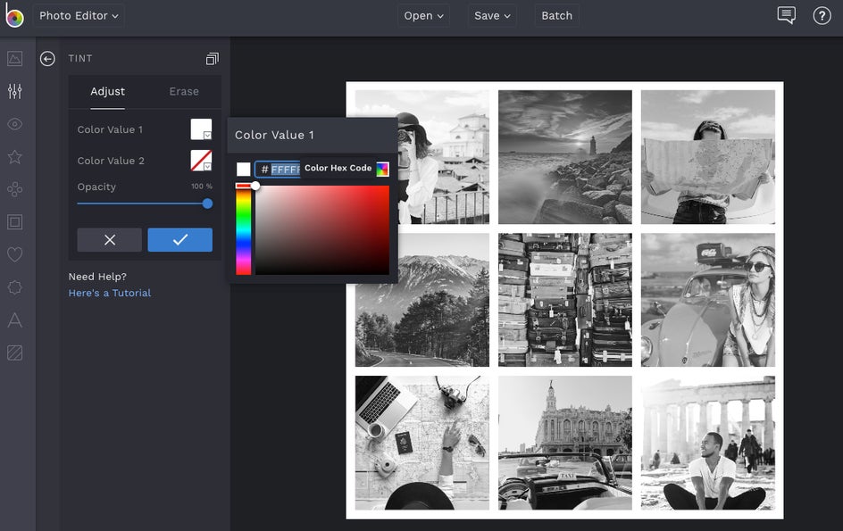
Follow the steps as before to tint. For greyscale, use Hex Code #FFFFFF in Color Value 1.
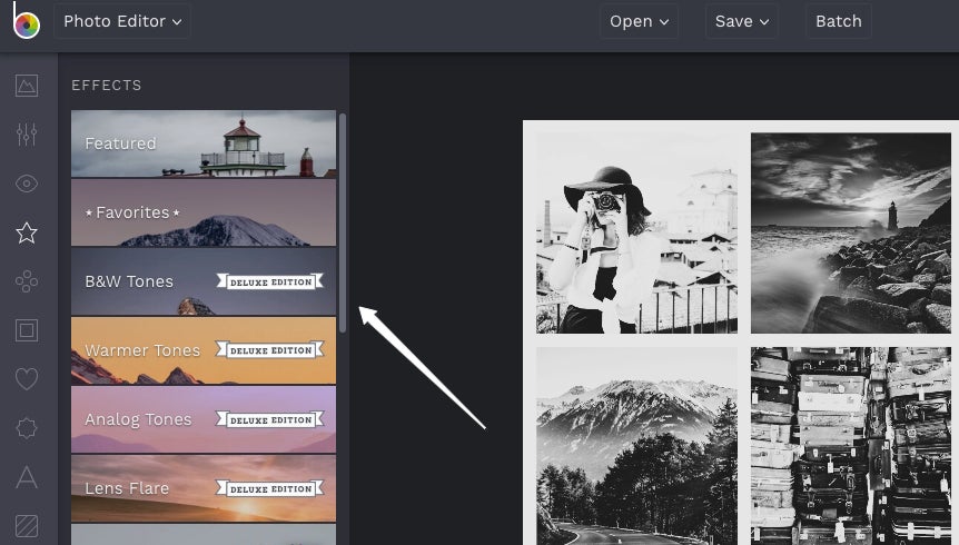
From here, you can play around with all the awesome BeFunky photo editing features like B&W Tones under Effects for a more artistic look.
Time to Get Monochromatic!
As you can see, there are so many different looks, feels, and designs you can create with monochromatic colors.
Ready to create your own? Head over to the BeFunky Designer now and get started. It is loads of fun.