How to Add a Drop Shadow to Your Designs
Drop shadows were a popular effect when digital designing platforms like Photoshop entered the scene. Recently, I have strayed away from using them because they often look fake and archaic. I didn’t realize until recently that designers are still using them – they have perfected the drop shadow so well that it is barely recognizable unless you are looking for it. The difference between drop shadows now and in the past is that they are subtle and natural now compared to bold, harsh, and fake-looking.
If you are wondering why drop shadows are being used, it is often times to create depth. I have found that when my designs are looking flat, adding a subtle drop shadow really changes the overall design and brings dimension to the design that was not there before.
3 Ways to Use BeFunky's Free Drop Shadow Tool
Today, I will show you what I mean by highlighting a few examples while specifically paying mind to typography, since this is where the drop shadow technique really makes a statement and enhances any poster or design. The great thing is that with BeFunky’s Graphic Designer, you can create a subtle and blended drop shadow easier than in expensive programs like Photoshop or Illustrator – for free!
1. Create Realistic Mockups
Whether you are showcasing your art on a mocked-up wall or table, drop shadows play an important part in the realness of your mockup. You want to pay attention to where is the light coming from in the room.
A harsher or darker shadow means that there is a harsher light projection. A softer shadow means that there is a softer light. Make sure that you have consistency here with the lights in the image and what shadows they cast for your drop shadows.
2. Make Cool Typographic Effects
In the past, drop shadows placed on text were a beast of their own. Look at the design styles we came from. These are the kinds of drop shadows that feel painful for me to look at. The reason this looks bad is that the drop shadow is highly contrasted with the background, as well as the text, and the distance and softness look unnatural.
Nowadays, drop shadows are used with typography to create cool effects and a funky kind of depth. I really like posters that use drop shadows on text in an overt way. It feels like the kind of painting storefronts used to do in the 40s and 50s.
The goal is to either create a subtle drop shadow or make a bold drop shadow a part of the overall design style. The middle ground drop shadow looks bad and outdated.
3. Add Depth to App Design
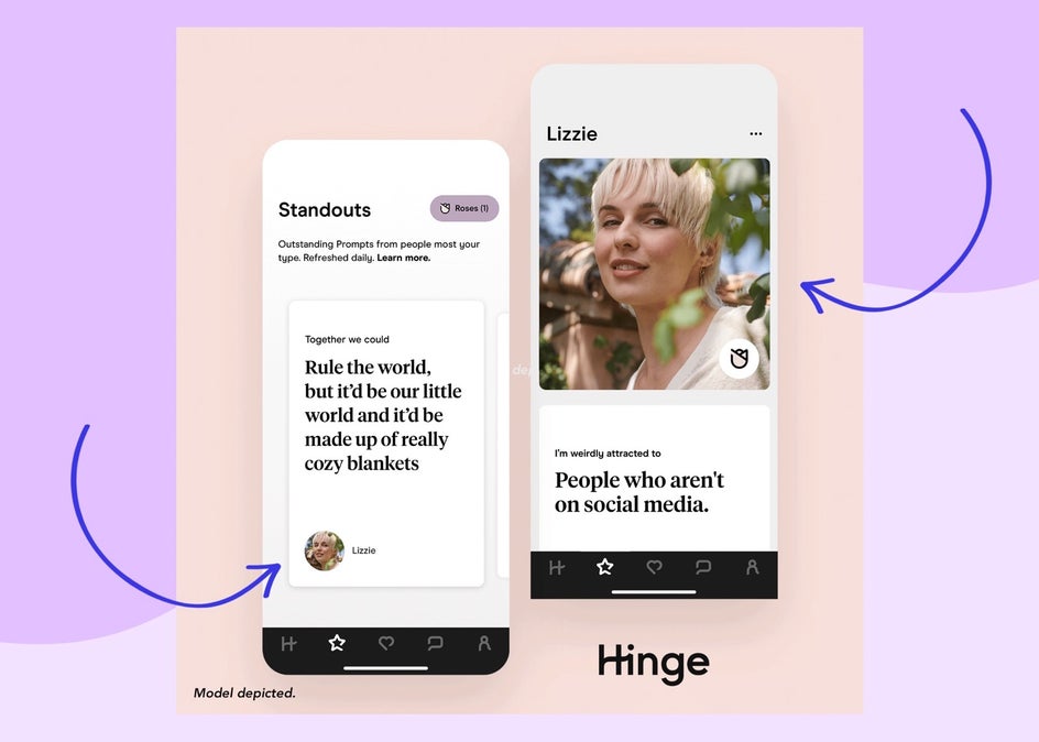
This has been the real game changer for me when it comes to drop shadows – and not even realizing that they are still being used in design. These kinds of drop shadows create depth and are used to encourage interactive movement. When you see a button with a shadow, it subconsciously sends you a signal that denotes it can be pressed – this usually indicates that you know how to design for UI (User Interaction). There is a whole psychology when designing that is really fascinating and you can tell that good designers know and use these psychological traits. Hinge's UI is a great example of how a drop shadow makes all the difference.
How to Add a Drop Shadow to Your Design
For this tutorial, we're going to create a typography drop shadow with the free Drop Shadow tool, but the steps involved can be translated to Making a typographic drop shadow harkens back to the days when signage was the primary design of small businesses. Back then, a great styled typeface was all you had to market yourself and show your shop's personality to passersby. We are going to do this two ways with BeFunky’s Graphic Designer.
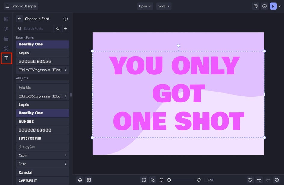
Step 1: Type a Word or Phrase
Type your word or phrase onto the design canvas by heading into the Text tab in the left-hand menu. Select Add Text. It is best to have a bold or weighted font as your main top font.
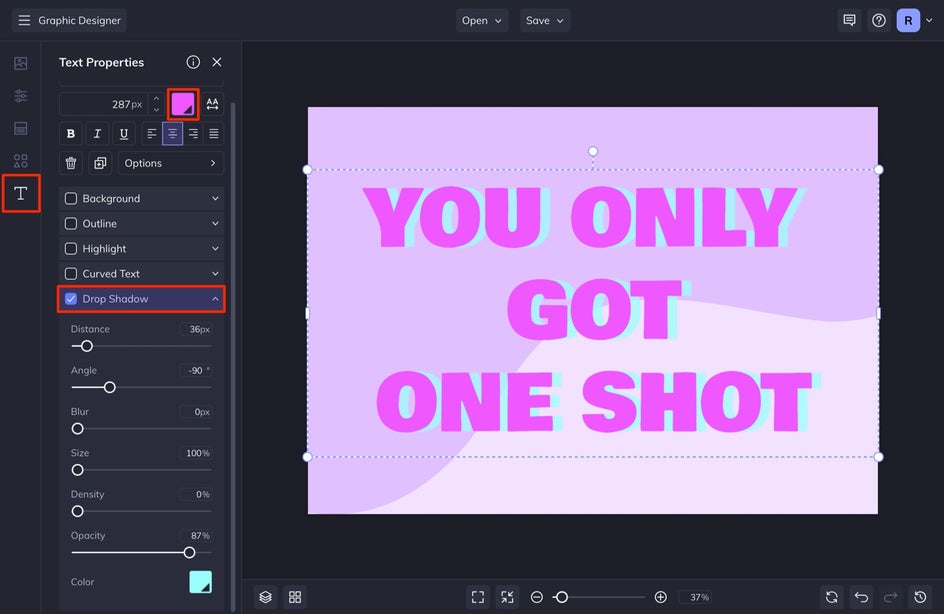
Step 2: Use the Drop Shadow Tool
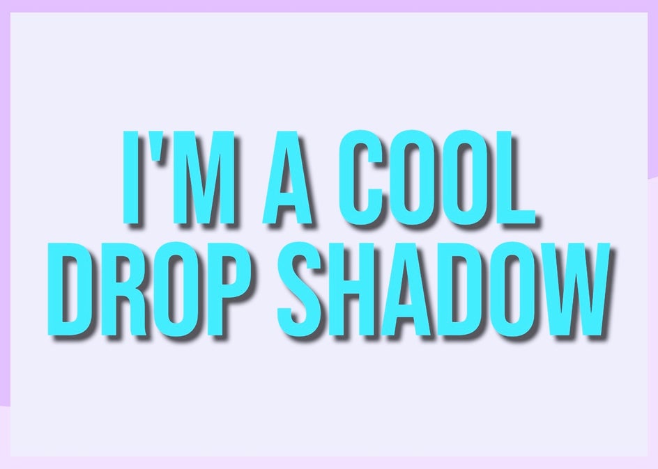
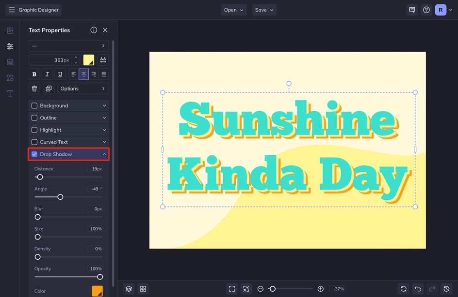
After you add your text, select your text and then select the free Drop Shadow option in the menu that appears. In seconds, you'll have a realistic drop shadow, ready to customize! Here, you can adjust things like the drop shadow Size, Density, Blur, and even Color. We are going to make sure that our drop shadow has a hard line and is colorful. To get this effect, lower your Blur, Size, and Density by sliding each scale all the way to the left. We are also going to adjust our Angle to 90° and then increase the Distance for a more dramatic effect.
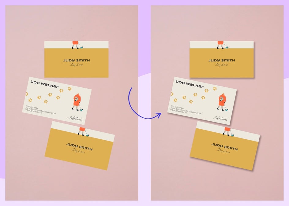
Design Hack: Apply the Same Drop Shadow Setting to Multiple Assets
With BeFunky’s powerful drop shadow tool in Graphic Designer, once you adjust and apply the drop shadow settings to a design element, it automatically applies the same drop shadow settings to the other elements you give a drop shadow. This honestly saves so much time when designing. All it takes is a single click, whereas, with other design platforms, you have to copy and paste and apply the same setting to other layers in your design.
As stated above, the benefit here is that once you set this drop shadow effect and apply it to one design element, you can automatically apply the same effect to other parts of your design without needing to adjust the drop shadow settings.
Another Way to Create a Drop Shadow With BeFunky
The other way that you can add a drop shadow to your text is by doing it manually – just duplicate your text and place it behind your main text. This allows you to add different styles or effects to your drop shadow. We'll show you how below!
Step 1: Type a Word or Phrase
Repeat Step 1 from the above section.
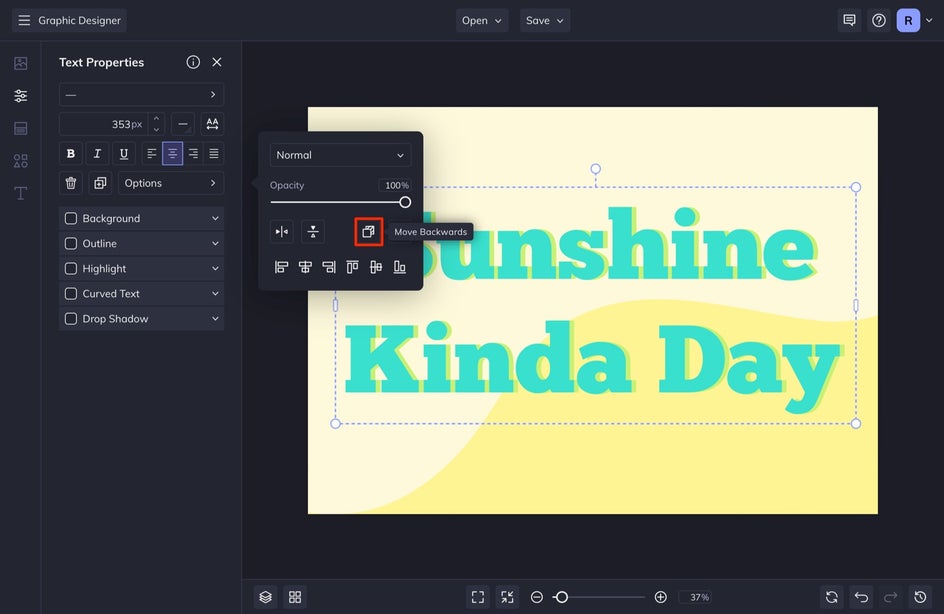
Step 2: Duplicate the Text and Adjust
After writing your word or phrase, duplicate your text by selecting your text and then selecting Duplicate in the Text Properties menu. You can also achieve the same result by pressing D on your keyboard.

Because you just duplicated the same text and color, it will be hard to see the duplication. To see it better, change the color of the duplicated text and then send it to the back by selecting Options and then Move Backwards.
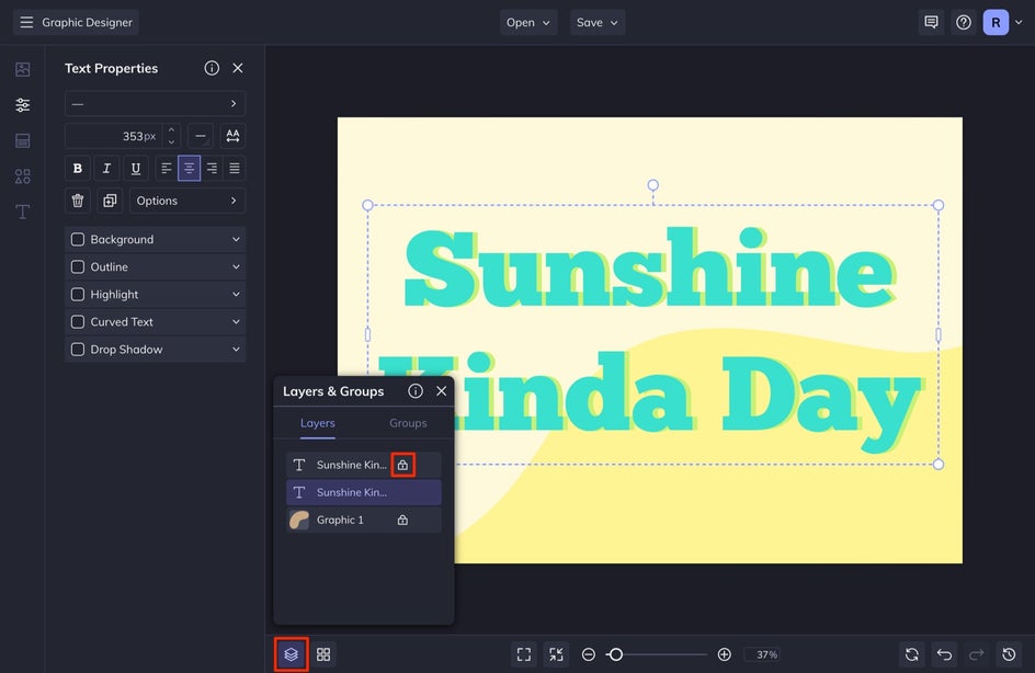
At this point, I also lock my top layer so that it is easier to grab my back layer. To do this, head down to your Layers & Groups button and select the lock on the top layer of text.
Step 3: Add an Effect or Style
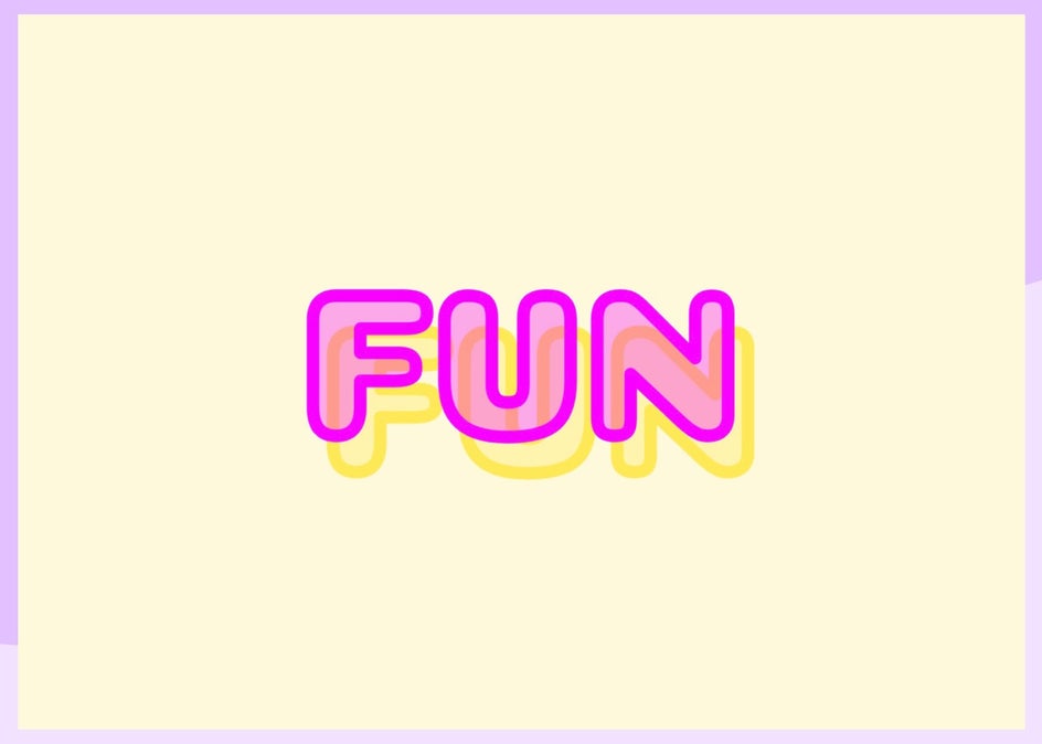
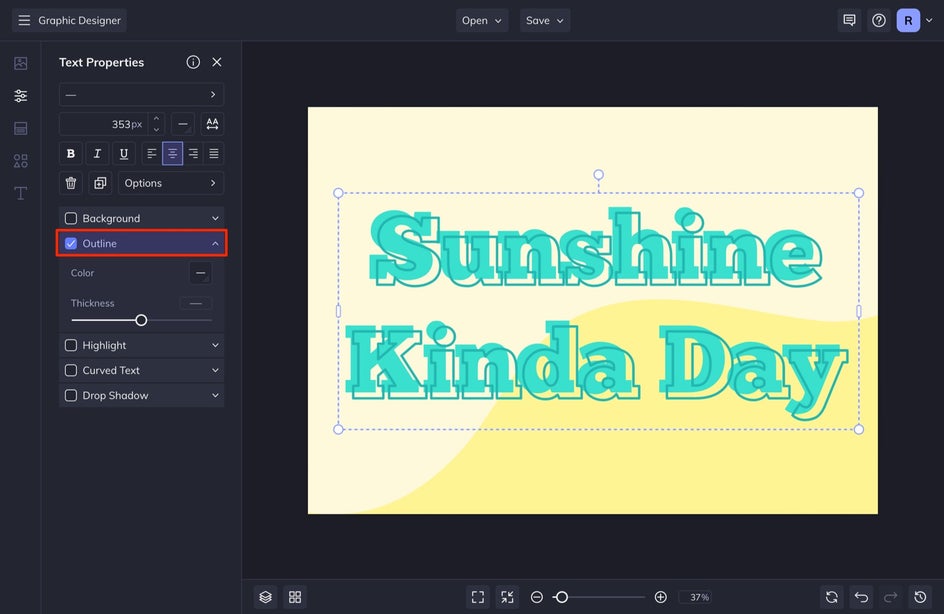
From here, there are many different options to adjust. You can remove the fill color and then select Outline, so your drop shadow is only the outline of your text (a popular effect). This also looks cool if you make the main text the drop shadow portion simply by moving the drop shadow text to the front.
You can also follow Step 2 from the Using the Drop Shadow Setting section and add a drop shadow to your duplicated text. This gives a very cool double drop shadow effect.
If you want to create some more dimension, you can turn your top layer text into an outline or add an outline to it and keep the fill color the same color as the duplicated drop shadow. I love this effect as it feels very retro and unique.
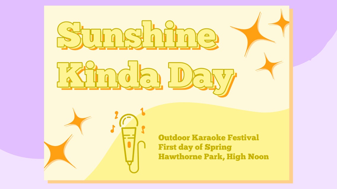
All you have to do is finish your design. We created a graphic for an outdoor karaoke festival. You can see here how it looks with the drop shadow and without.


Creating Drop Shadows With BeFunky Is Easy
With these two ways of creating drop shadows, you have multiple ways to achieve a drop shadow effect. Whether you want to create a subtle drop shadow to show dimension or give your typography some flare, drop shadows can do it all. Create your next drop shadow design with Befunky’s Graphic Designer.