Composition – How To Get It Right (Part 1/2)

It's a toss up between lighting and composition as the top component for shaping the impact of your images. So let's just say it's a tie, and talk about composition in this article and I'll talk about lighting in the next.
Composition, the design of a photograph, is what immediately sets one photo apart from another of the exact same subject, grabs a viewer's attention, engages the brain and invokes other emotional feelings.
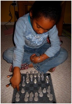
I took the photo to the left with my Canon PowerShot D200. It is a nearly-overhead view of a little girl learning to play chess for the first time. It follows the Rule of Thirds pretty much dead-on, but it's an effectively photo because of the way color is used in the composition as well.
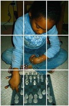
Oh, what's the Rule of Thirds? It's a concept in which you divide a picture frame in to equal thirds horizontally and vertically (see image below), and you want to place the focus point of your subject near the intersecting vertices. Notice that doing so puts a subject slightly off-center, but this is a good thing. By following the Rule of Thirds, you inherently create tension within the picture frame and that tension draws your viewer's eyes. It also allows you to effectively put secondary design elements into your frame. In the photo of the little girl, your eye is drawn to her assumingly pensive face as she contemplates her next chess move (which practically dead-center at one of the intersection points). And then your eye is drawn to the chessboard (specifically the area where her finger points next to a pawn, again extremely close to the intersecting points.
Notice, also, that the way I composed/framed this photo, I'm slightly overhead and filling the frame with only the little girl and the chessboard. From this high vantage point/perspective, everything else in the room is framed out and we are squarely in the world/mind of the little girl. Imagine the same little girl doing the same thing, but I shot a profile shot... The surrounding, irrelevant elements in the room would also be in the photo. Imagine the shot, if I was closer to her eye level... Then the image wouldn't have the encapsulated feeling that it does, and two main subjects would not be at opposite ends of the frame; squared off as if they are dueling against each other --which they are, as she is remembering the piece movements. At eye level, her body positioning would not be as gripped into the moment at hand.
So vantage point, filling the frame and placement of objects in the frame to create a balance are the key components that you must take into account even in the simplest of pictures. By being aware of these components, you can make mundane subjects exhilarating.
I also mentioned color. The neutral blue of all her clothing (and to some extent the chessboard) is on opposite side of the color spectrum as her skin tone. So her face and hands pop out of the photo, too.
Below is another photo that is more complex in its design and execution. But the same elements come into play – vantage point, filling the frame, specific focus point/depth of field and placement of objects in the frame at the intersection points (the Rule of Thirds) – and cause this photo to be highly dynamic, yet still very "simple".
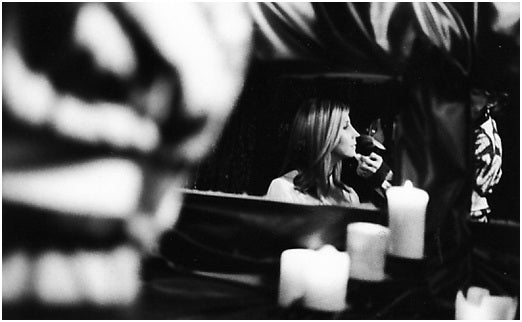
As this is a black & white photo, the monochromatic tones are also important (the same way the intensity of color is important in a color photo). The main subject – the woman having make-up applied to her face right before a concert – can be seen through all the clutter in the mirror; in fact, she's the only element that is in sharp focus and rendered with discernable detail. All the other elements are of stark tonal contrast – deep blacks AND strong whites – but with sufficient detail and shape so you know what they are (or out of focus enough to provide form, but nothing else). The distribution of tones throughout the image creates depth and dimensionality – one of the key things for impressive photography.
This was shot with a Nikon N80 using Kodak Tri-X 35mm film. Really no different in the "work" than the photo of the little girl shot with a digital Point&Shoot camera. The same criteria apply regards of what type of camera that you're using. It's all in the execution of the composition.